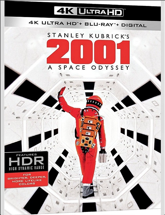
A friend has sent along some comparison shots of various versions of Stanley Kubrick’s 2001: A Space Odyssey, including a striking screen capture from the new WHE 4K Ultra HD Bluray (streeting on 11.20). I’ve promised not to post this photo for now but I’ll be able to post one or two 4K images tomorrow, or so I’m expecting. I’m relieved to say that it seems quite clear (as I trust the person who sent the images) that Chris Nolan‘s piss-and-teal color scheme, which was seen everywhere last summer when Nolan’s unrestored nostalgia version played in theatres, has not been delivered by the new 4K disc.
For years I’ve been hoping to see Stanley Kubrick‘s 2001: A Space Odyssey projected in genuine IMAX. It was announced today that serious large-format presentations will finally happen on 8.24, or just over three weeks hence. The Hollywood Reporter‘s Pamela McLintockreports that four IMAX theatres (in Burbank, Manhattan, San Francisco and Toronto) will project the 1968 classic on what I presume will be titanic IMAX-sized screens.
You want irony? A video posted at the bottom of McLintock’s THR story, titled “2001: A Space Odyssey Anniversary / A Look Back”, shows scenes from the film that haven’t been Nolan-ized (i.e., aren’t tinted teal or piss-yellow).
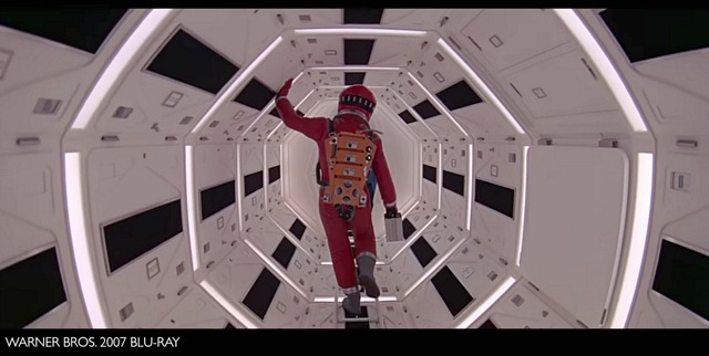
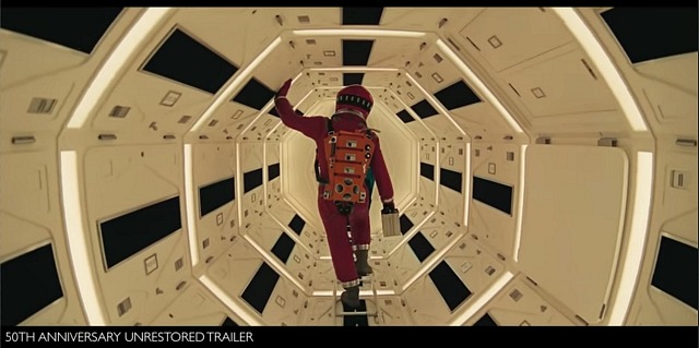
On 4.24 a guy named Krishna Ramesh Kumar posted a video essay that compares the forthcoming, Christoper Nolan-approved, unrestored 50th anniversary re-release of 2001: A Space Odyssey with corresponding images from the Warner Home Video 2007 Bluray. Please watch the essay but pay particular attention to three sets of comparison captures that I’ve posted below. The 2007 Bluray images are on top; the unrestored 70mm Nolan versions are below. The Nolan is obviously warmer, yellower and even teal-ish with weak contrasts and less detail. Plus it has no deep blacks or true whites. It looks weathered.
And this, the Nolan, is apparently what’s being re-released into theatres in May. The images rendered for the upcoming 4K Ultra HD version of 2001, which pops on May 8th, will be restricted to those with 4K Bluray players. It seems obvious to me that the colors in the Nolan aren’t as satisfying and the images are less precise than even Warner Home Video’s 11-year-old Bluray, much less whatever the new 4K version will deliver. This seems absolutely NUTS.
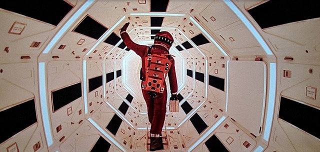
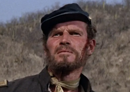
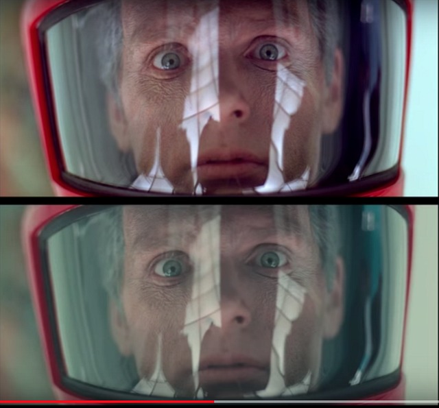
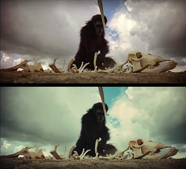
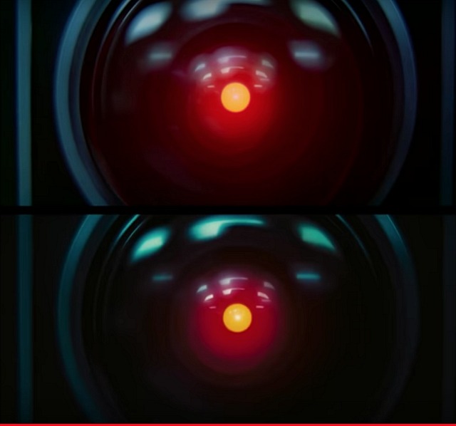
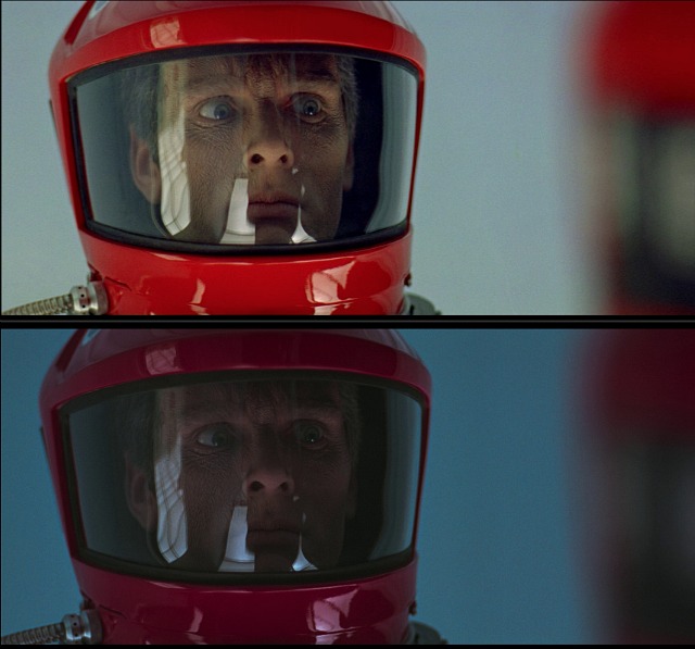
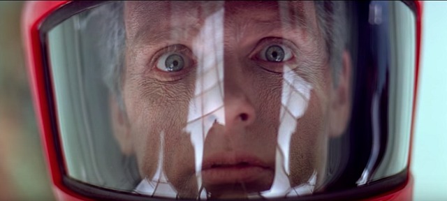
Examine the 2007 version of Dave Bowman‘s face through his red space helmet visor vs. the far less distinct Nolan version — anyone who says that the Nolan version is preferable needs to be hunted down by men in white coats RIGHT NOW and sent off to an insane asylum. Examine the “Dawn of Man” bone-bashing images — the sky in the 2007 version is true blue but a kind of greenish teal in the Nolan version. Examine the two close-up images of HAL — you can obviously see more red-glow detail in the 2007 version while the Nolan is darker and murkier. Who in their right mind would say “the Nolan versions are better”? This is FULL-ON INSANITY.
I’ve arranged to see WHE’s forthcoming 2001: A Space Odyssey 4K UHD Bluray (streeting on 11.20) at a friend’s place (possibly as soon as this weekend), but some screen captures & comparisons posted by DVD Beaver‘s Gary W. Tooze are alarming. Because what I’m seeing are images that are significantly darker than the 2001 images I’ve been looking at for decades on theatre screens, VHS, laser discs, DVDs and the 2007 WHE Bluray. And the sides of the earlier Bluray (2007 and 2011) have been sliced off, for some reason, on the 4K.
I need to wait until I see the 4K myself, but the Tooze images are not pleasing, and the last time I checked he wasn’t blatantly misrepresenting Bluray images as a rule. So I’m wondering how or why Stanley Kubrick‘s 1968 classic is looking so damn murky and muddy.
All I know is that I’m alarmed all over again. Remember that despite what we’ve all read about this not being the non-restored Nolan “nostalgia” version with the piss-yellow and teal tints (and it’s really not, I’m told), this WHE 4K Bluray has had three fathers — Ned Price, Chris Nolan and Leon Vitali. And at least one of them is the bad guy here because 2001 has never been this dark, and it never should be. I mean, some of the 4K screen captures are ridiculous.
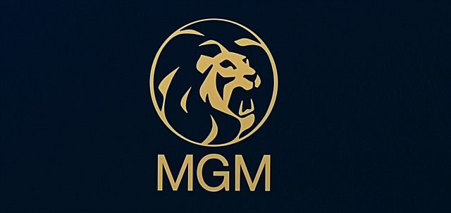
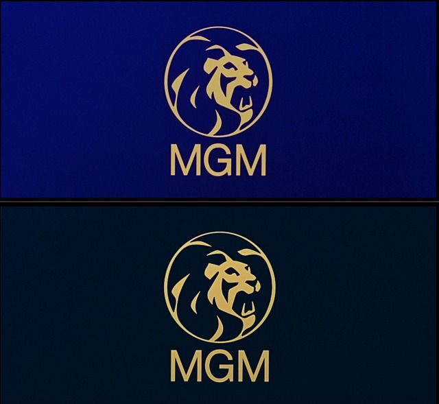
1. Tooze comparison #1 — the MGM logo. All my life the color of 2001‘s MGM logo has been a slightly muted publisher’s blue, like the top image from the 2007 Bluray. Now it’s a mixture of gravel gray and midnight blue — like the color of flagstone mixed with a dusky, early-evening sky. In short, it’s a lot darker and completely different than the logo image I’ve been looking at for half a century now. What is this?
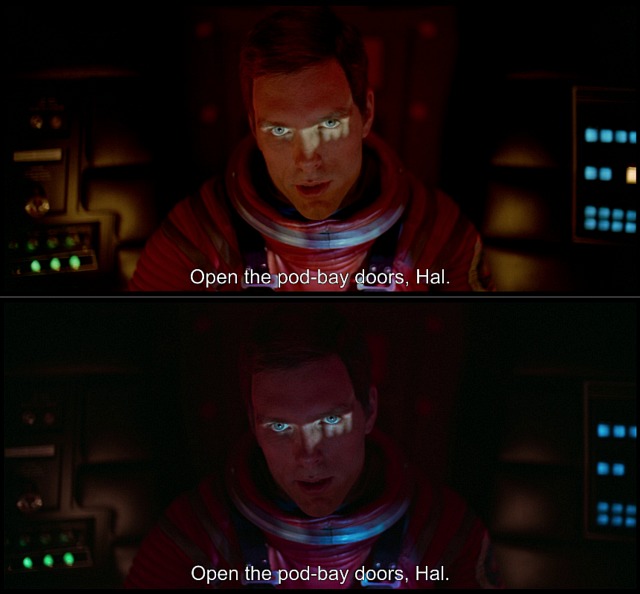
2. Tooze comparison #2 — “Open the pod bay doors, Hal”. In the above 2007 Bluray image, Dave looks like he always has inside the pod while asking HAL “what the hell’s the problem,” etc. In the bottom 4K image, he looks like a demon ghost from The House on Haunted Hill. All you can really see are his piercing, key-lighted eyes. What the hell is this?
3. Tooze comparison #3 — Space-suit Dave in French chateau. The 2007 Bluray image of red-helmeted Dave is perfect, but you can barely make out his facial features in the 4K image. This isn’t just overly dark — it’s absurdly dark, as in the person who mastered this shot was (a) drunk, (b) stoned or (c) an anarchist who snuck into the WHE video mastering room with the intention of fucking things up.
4. Tooze comparison #4 — Discovery air-lock chamber. If you compare closely you’ll see that visual information on the right and left sides of the 2007 Bluray image (which was taken from a 35mm source) has been sliced off for the 4K.
Digital Bits editor Bill Hunt has posted “pixel camera” captures of the forthcoming 4K Bluray of 2001: A Space Odyssey (WHE, 11.20). Bill’s Facebook reaction: “Yep…it’s gorgeous. And properly color-graded. No Nolan ‘unrestored’ nonsense. NOTE: These pictures are cellphone camera photos of a projection screen — NOT FRAME GRABS. Trust me, the film looks exactly as it should in HDR.”
The release date of WHE’s upcoming, highly controversial 4K Bluray of 2001: A Space Odyssey was recently bumped back to 11.20. A colleague reports, however, that Amazon and other retailers “are apparently getting limited stock in early and have already begun shipping, and so some people got it in the mail [yesterday].”
Here’s the big news: “My copy arrives on Monday, but I have readers who have it in hand already and are saying it’s not the Chris Nolan version” that played in theatres last summer — i.e., no piss-yellow or teal tinting.
Frame capture from 2007 Bluray of 2001: A Space Odyssey.
Same image copied from WHE trailer for forthcoming 4K Bluray, which contains the same colors and specificity seen in the Chris Nolan version now in theatres.
This is excellent news if true. But if the disc has indeed been shorn of Nolan’s influence I’ve no choice but to presume one of two things.
Or two, that WHE honcho Ned Price considered widespread adverse reactions to Nolan’s urine-and-teal version and got cold feet and decided to produce a 4K Bluray that — shocker! — would present Stanley Kubrick‘s classic as it actually looked when it opened in 1968.
If the second scenario reflects what actually happened (i.e., that WHE marketers were in fact told by management that the 4K would in fact contain the values of the Nolan version, only to be made to look like absolute fools when a cleaner, truer version is released to the public), then Hollywood Elsewhere has to take at least some credit for changing Price’s mind.
Because I hammered and hammered on this story for months on end, bemoaning the urine-ization of a great film and wondering why WHE would willingly vandalize 2001 just to fortify a sweetheart relationship between Price and Nolan.
My source is going to get his 2001 4K disc on Monday, and has promised to get back to me. I’m naturally hoping to be able to report that the de-urineizing and untealing of 2011 has in fact happened, and that everyone can take to the streets and shout with glee that Nolan’s 4K Bluray version is indeed dead and that the whole urine-and-teal nightmare is over. Talk about a happy ending!
From Glenn Erickson‘s Cinesavant, posted yesterday: “The scary news is a report from correspondent Simon Wells, about the much-touted Christopher Nolan restoration of 2001: A Space Odyssey. I’d like to know if other readers have seen the show, and if their prints were different, or better. Here’s Simon’s note — actually, two notes I’ve shuffled together:
‘Hi Glenn, Just wondering if you happened to see the recent Nolan de-restoration of 2001 in 70mm in recent months?
“I did and was utterly horrified by the general murkiness, blown out white and general sludginess. The colour grade was horrible, the detail pitiful. The scenes inside the space wheel where Floyd talks to Rossiter and the Russians were blown out and looked abysmal. Worse still was the new teal and amber color grade, which I am assuming is how the upcoming 4K release will be presented. I don’t think I have ever seen [this film] look so bad.
‘Getting films you never thought you’d see on Bluray is great, but this kind of vandalism just depresses me no end. I’d be very curious to hear your thoughts. — Simon Wells’
Erickson: “Am I stirring up a non-issue, taking a reader’s evaluation on something I haven’t seen myself? The last time I saw 2001 on a big screen was at the 2012 TCMfest, and the 70mm print looked just fine to me; I’ve never seen a bad print, even in 35mm. I can say that the WB film management and restoration experts are some of the finest in the world, and that their 2003 remastering of Ryan’s Daughter was the most perfect film presentation I’ve ever seen. I’m all for celebrity filmmakers helping promote film restoration, but I’d hardly think that 2001 was being neglected.
“I am curious to get more feedback on the 70mm reissue, which I am told is a different animal than the special IMAX reissue coming up shortly. So if you saw 2001 in ‘Nolanvision’ please let me know!
“Thanks for reading! — Glenn Erickson”
HE comment: Does Erickson live in a cave without wifi? How could he have missed the furor over Nolan’s teal-and-piss-yellow non-restoration? How could he have bypassed seeing the Nolan version when it played at the Arclight?
Why did WHE change the jacket art? My guess (just a guess) is that the glarey white-and-red cover was deep-sixed because it doesn’t agree with the subdued yellow-ish image from the same scene in the Chris Nolan-approved 4K version of 2001, which will “street” on 10.30.
If you haven’t been keeping up, Nolan’s yellow-teal “nostalgia” version elbowed aside a previous 4K UHD version of Stanley Kubrick‘s 1968 classic. 70mm prints of Nolan’s version opened in theatres a while back. The gleaming white 4K jacket-art image speaks for itself. Directly below is a grab from the scene in question as found on WHE’s 2007 Bluray. Below that is the same scene in Nolan’s un-restored version, which is the basis for the new 4K Bluray. The subdued yellowish tint is obviously darker and more subdued than the 2007 Bluray image, and is dramatically darker than the gleaming bright image from the three-month-old 4K jacket image. Do the math.
On 6.21.18 Warner Home Entertainment posted a trailer for the forthcoming 4K Bluray of 2001: A Space Odyssey, which will street on 10.30. And it’s horrifying! Because the yellowish-teal color tint in this trailer is obviously the same color tint as the currently-playing Chris Nolan version of 2001. Watch it and tell me what you think.
It seems obvious (and please tell me how I could possibly be wrong about this) that the 6.21 4K trailer is proof that the yellow-teal Nolan version has been used as the basis for the forthcoming 2001 4K Bluray.
This means that WHE wasn’t kidding when an official press release (also issued on 6.21) stated that “for the first time since the original release [of 2001 in April 1968], new 70mm prints were struck from pristine printing elements made from the original camera negative” — i.e., the Nolan version. “A longtime admirer of the late American auteur, Christopher Nolan worked closely with the team at Warner Bros. Pictures throughout the mastering process.
“Building on the work done for the new 70mm prints, the 4K UHD with HDR presentation was mastered from the 65mm original camera negative,” the press release said. “The 4K UHD also includes both a remixed and restored 5.1 DTS-HD master audio track, as well as the original 1968 6-track theatrical audio mix.”
Frame capture from 2007 Bluray of 2001: A Space Odyssey.
Same image copied from WHE trailer for forthcoming 4K Bluray, which contains the same colors and specificity seen in the Chris Nolan version now in theatres.
Posted on 6.21.18: “The key words, obviously, are ‘building on the work done for the new [Nolan-approved] 70mm prints.’ Question: If color-timer Leon Vitali told me that “the 4K has more clarity and sharpness and detail” than the 70mm Nolan version (and he did tell me this), why would the WHE people indicate that the Nolan nostalgia version and the 4K version are close relations if not more or less the same?
“One could surmise that Vitali’s 4K version was one thing back in April, but that Nolan has recently stuck his nose into the mastering of the 4K and that things have changed for the worse. I’m not saying he has stuck his nose into the process, but the WHE press release certainly suggests this.”
Unless the person who presided over the making of the 2001 4K trailer is deranged or incompetent, there’s very little ambiguity about this now. WHE’s trailer for the 2001 4K proves that the Nolan nostalgia version (i.e., a replica of the film Nolan saw on 70mm when he was 7 or 8 years old) and the 4K Bluray version are indeed one and the same. So Nolan did in fact stick his nose into the 4K Bluray mastering and changed the look of it.
Please consider two seemingly crucial factors about Nolan and his perspective on Stanley Kubrick‘s 1968 classic.
And two, Nolan has stated that he wanted to create an “unrestored” 70mm version to look like a 70mm version he saw with his father in Leicester Square when he was 7 or 8 years old. Except Nolan was born on 7.30.70, or more than two years after 2001 premiered in the big cities. The 2001 Nolan saw with his dad in Leicester Square presumably screened in ’77 or ’78, so he didn’t see the original roadshow version.
Please once again consider a comparison trailer (posted on 4.24.18 by Krishna Ramesh Kumar) that presented the differences in color in the 2007 Bluray of 2001 vs. the then-forthcoming Nolan version that premiered in Cannes. It showed that the yellowish-teal colors in the Nolan version were quite different than the 2007 Bluray colors.
I believe that WHE’s decision to kowtow to Nolan’s yellow-teal vision of 2001 is nothing short of vandalism. I think it’s a flat-out tragedy. I think Leon Vitali, who did the color timing on an earlier version of the 4K Bluray and who is supposed to be the keeper of the Kubrick flame, needs to stand up and say “no, this is wrong…the Chris Nolan nostalgia version is not how 2001 should look.” I think anyone who knows what 2001 should look like should speak up also. This is horrific.
The unrestored, original-elements Chris Nolan version of 2001: A Space Odyssey screens early tomorrow evening (6:45 pm) at the Salle Debussy. Remember that the trailer for this looked yellowish, teal-tinted and minus the sharpness found on the 2001 Bluray. If Nolan’s version looks yellow-teal on the big screen, bombs away.
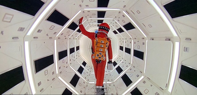
Examine the 2007 Bluray version of Dave Bowman‘s face through his red space-helmet visor vs. the far less distinct Nolan version. Anyone who says Nolan’s is preferable needs to be hunted down by men in white coats right now.
2007 Bluray capture above; unrestored Nolan version below.
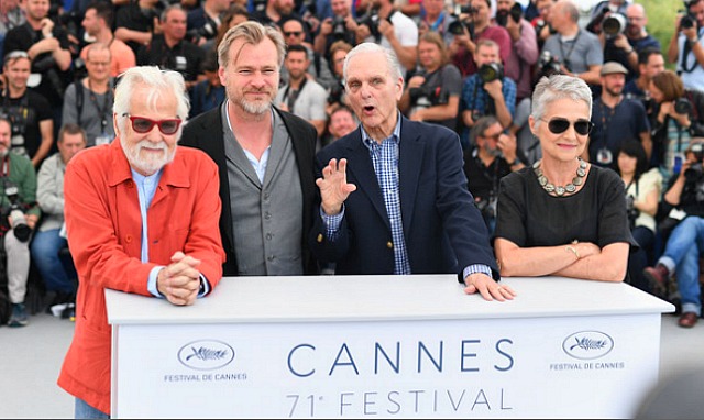
Nolan discussing his non-restored 2001 at the Salle Bunuel earlier today.
Remember what film restoration guru Robert Harris told me on 3.28.18 (“Not So Fast On That 70mm 2001 Mastering”): “The new 70mm print they’ll be showing in Cannes will not look like 2001 did in 1968. It can’t be an authentic recreation of how the film looked 50 years ago for any number of reasons. Color stocks, black levels and grain structure are different now, color temperature of the lamps has changed but can be adapted. They were using carbon arc lamps in ’68 and they aren’t now, and on top of everything else the film stock is different — the stock used for original prints was a stock that arrived back in 1962. And so the images [may] ironically look too clear.
“What they show may be beautiful, but they’re not working from the original camera negative, which has been badly damaged. They’re working from ‘new printing elements’ taken from the original negative, which basically means a fourth-generation print. All original prints were struck from the camera original. They won’t be using the original film stock that the original 2001 was printed on, which was Eastman 5385, a 1962 film stock, that had appropriate film grain to the way the film had been designed. So it’s not off the negative, they don’t have the original film stock, and they’re be making it off a dupe rather than using 4K or 8K files.
Nobody would love to see Chris Nolan‘s Tenet (Warner Bros., 7.17) in a big, swanky theatre more than myself. But can someone explain what it means to “work overtime to ensure theaters can re-open and that movie exhibition business can come roaring back to life,” as IMAX honcho Richard Gelfondsaid earlier this week about Nolan? How does anyone “work” to make the pandemic go away?
By the way: In my mind Dunkirk is one of Nolan’s greatest films, right up there with Memento and The Dark Knight. I’ve never watched a 4K version of Dunkirk at home (and that in itself might tell you something) but it’s certainly gained upon reflection.
And yet after the curious plot gymnastics of Inception, the deliberately muddy sound design and infuriating storyline in Interstellar and the atrocious yellow and teal-tinted nostalgia version of 2001: A Space Odyssey that Nolan oversaw, I’d be lying if I didn’t admit to feeling a very slight trepidation about Tenet.
Consider what the trailer might amount to if you take away the reversed action sequences and one-two punches like “what happened here?” and “it hasn’t happened yet”. Seriously, it feels like a kind of cinematic three-card monte.
And don’t forget that aside from being a moderately engaging, good-looking actor, John David Washington lacks that tingly, charismatic “it” factor. Nolan hired him because his BlacKkKlansman performance had generated a certain amount of heat, but remember that old remark about Marilyn Monroe‘s star quality, about how “you can’t take your eyes off her when she enters in a scene”? This is precisely what JDW doesn’t have.
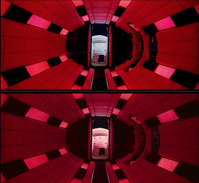
I can report directly that on the new 4K 2001 disc, the Discovery tunnel wall is indeed a kind of light rose-beige color. And yet the tunnel in the 2007 2001 Bluray, which I looked at this morning, is straight white. And I’m doubting the rose-beige thing. As I wrote a few days ago, “After watching 2001 in theatres at least 14 or 15 times over the last half-century, I’ve never once seen a print with a faint rosey-orange tint in the passageway scene. Not once, not ever.”
You have to wonder why Stanley Kubrick would have said to his set designer, “I don’t want the walls to be plain white or bone white…I want a William Haines feeling…I want a warmer, gentler, more feminine color.” I could see George Cukor or Vincent Minnelli requesting this, but not Kubrick.
from 2007 Bluray.
from 2018 4K Bluray (second generation capture).
I can also report that the MGM logo on the 2007 Bluray is indeed bright blue with white lettering, and that the same image on the 4K disc is dark blue with amber lettering. I’ve seen them both with my own eyes, and only one is correct. I think it’s the former. I think the dark blue-with-yellow-lettering logo is bullshit.


 Frame capture from 2007 Bluray of 2001: A Space Odyssey.
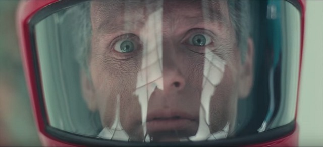 Same image copied from WHE trailer for forthcoming 4K Bluray, which contains the same colors and specificity seen in the Chris Nolan version now in theatres.
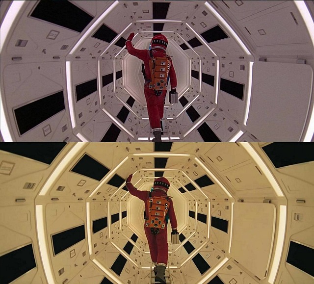
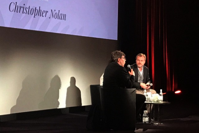 Nolan discussing his non-restored 2001 at the Salle Bunuel earlier today.