Four days ago Ben Kenigsberg posted a N.Y. Times piece about Otto Preminger‘s Anatomy of a Murder (’59). It praises the Jimmy Stewart courtroom drama, which costarred Ben Gazzara, Lee Remick and George C. Scott. It especially admires Preminger’s willingness to “trust [that] audiences will dwell in gray areas.”
Here’s a passage that made me sit up: “While some other Preminger films of the era (’58’s Bonjour Tristesse, ’59’s Porgy and Bess) used widescreen formats like CinemaScope or Todd-AO, Anatomy of a Murder instead favors claustrophobic compositions that ask viewers to judge several characters’ reactions at once.”
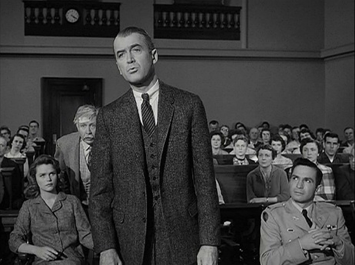
Excuse me but if Kenigsberg had tracked down the boxy (1.37:1) version of Anatomy of a Murder, which is only available on a 21-year-old Sony Home Video 480p DVD, he would have realized that in no way, shape or form is this a claustrophobically-framed film. It’s actually loose and roomy and quite relaxed and laid-back…in my view the exact opposite of cramped and congested. Because it has room to move and room to breathe…because it inhales and exhales that northern Michigan air like a jazz-loving attorney on a fishing trip.
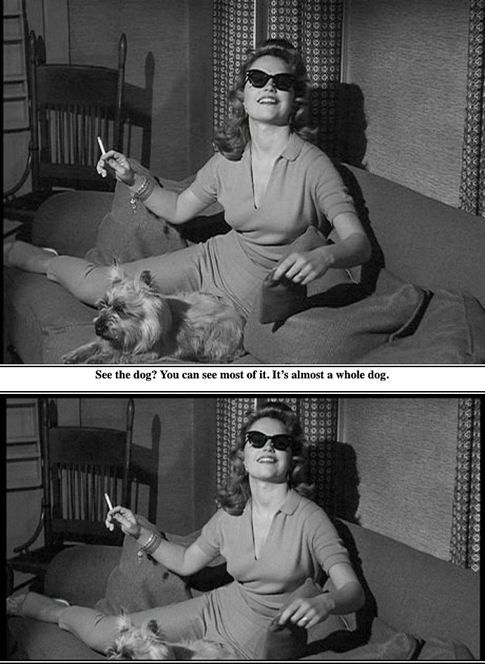
Here’s how I explained it nine years ago:
“Otto Preminger‘s 1959 film looks sublime at 1.37. Needle sharp and comfortable with acres and acres of head space. Plus it’s the version that was shown on TV for decades. It looks stodgy and kind of grandfatherly, true, but that’s fine because it’s your grandfather’s movie in a sense. Boxy is beautiful.
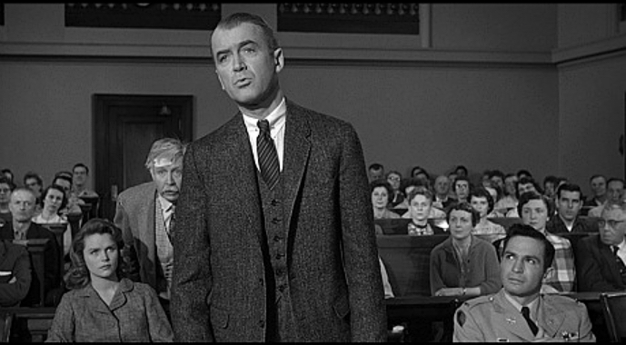
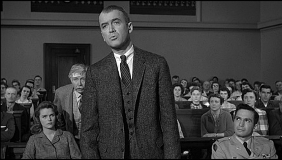
“It is perverse if not diseased for Criterion to deliver their 2012 Bluray version — obviously the best that Anatomy of a Murder has ever looked on home screens — with one third of the originally captured image chopped off. Flip the situation over and put yourself in the shoes of a Criterion bigwig and ask yourself, ‘Where is the harm in going with the airier, boxier version?’ Answer: ‘No harm at all.’ Unless you’re persuaded by the 1.85 fascist cabal that a 1.37 aspect ratio reduces the appeal of a Bluray because the 16 x 9 plasma/LED/LCD screen won’t be fully occupied.”
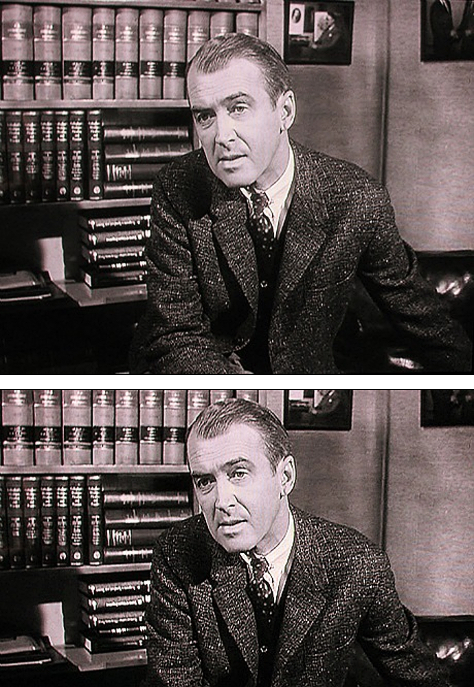
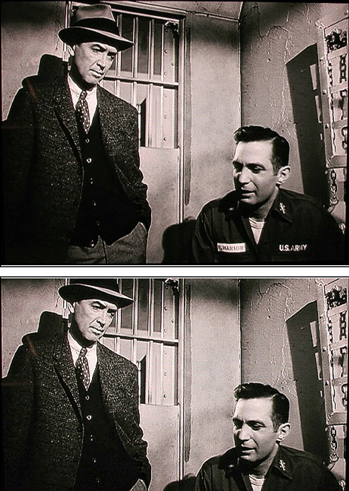
The above comparison show that cropping the image down to 1.85 from 1.37 doesn’t kill the visual intention. In the 1.85 version Stewart simply has less breathing room above and below his head. But the comparison below makes my case. Consider a scene between Stewart and Gazarra in a small jail cell. The boxier version is clearly the preferred way to go. It feels natural and plain. The 1.85 version delivers a feeling of confinement, obviously, but Otto Preminger wasn’t an impressionist. He was a very matter-of-fact, point-focus-and-shoot type of guy.”
