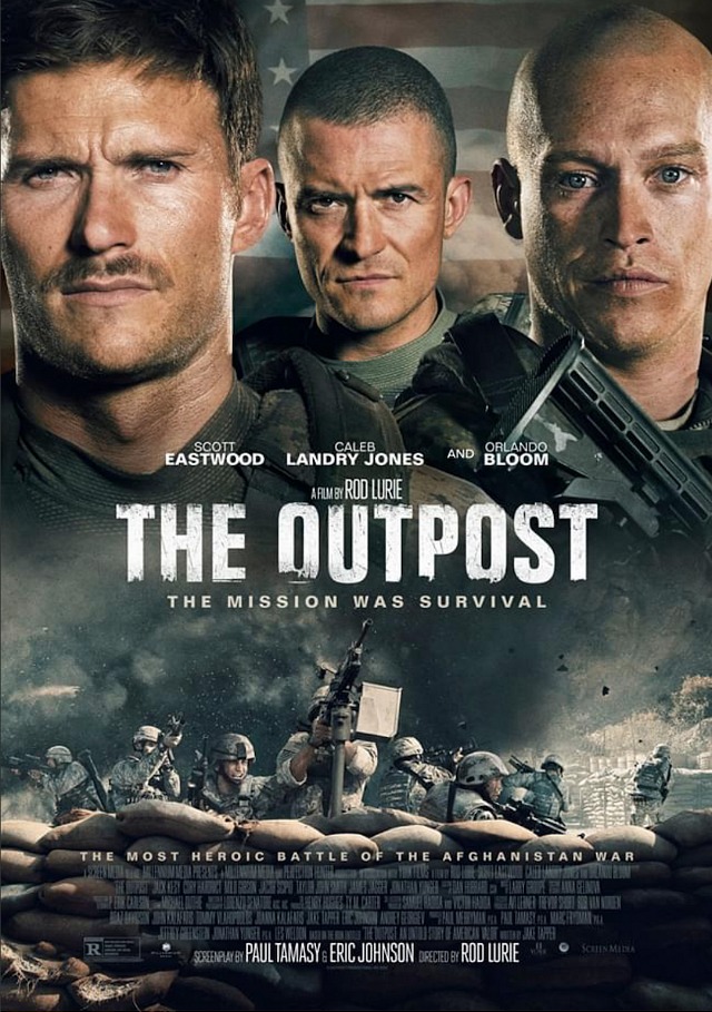
I’m not a marketing genius and certainly no expert in deciding what kind of poster works best in terms of sparking enthusiasm and putting butts in seats. I just know what looks cool and right, and I’m telling you that Rod Lurie‘s The Outpost (Screen Media, 7.2) is much, much better than the just-released poster suggests.
Forgive me but the one-sheet makes it look like a Cannon release from the mid ‘80s. Like some Chuck Norris or Michael Dudikoff film being sold at the AFM or in the Cannes market.
Lurie’s film delivers on a level far above that, trust me.
Outpost costars Scott Eastwood, Orlando Bloom and Caleb Landry Jones are not movie stars and yet the poster is saying “we’ve got three heavy-hitters here, and together for the first time!”
Screen Media needs to create an alternate poster — something classier and artier, maybe some kind of son-of-Saul Bass visual concept. Something that says smarthouse drillbit. I’m sorry but the current poster says “Menahem Golan & Yoram Globus present!”
HE is asking all gifted photoshop artists to whip together a Bass-styled poster. Something that looks like the one-sheet for Exodus or The Man With The Golden Arm…something in that realm.

