Last night I saw Steven Soderbergh‘s Unsane (Bleecker Street, 3.23), an intriguingly creepy, Shock Corridor-like psychodrama about a smart, blunt-spoken businesswoman (The Crown‘s Claire Foy) coping with a sudden, bizarre imprisonment in a private medical facility in Pennsylvania. It also has to do with stalking, delusion and what I saw as mounting insanity.
Unsane is fairly pulpy — a genre wallow — but as a spooky and claustrophobic portrait of institutional oppression and psychological upending it isn’t half bad. It’s shocking, unnerving and…I don’t know, eerily nightmarish and drearily suffocating at the same time?
As with any Soderbergh film you’re always aware of a fine intelligence behind each and every creative impulse or decision — every shot, cut and line says “smarthouse.” Ditto the oppressively dark lighting and brownish-greenish colors. And at no time are you saying to yourself “oh for God’s sake, lemme outta here, this is awful”…as I’ve said in the midst of most many horror thrillers.
There’s a place in the realm for films like Unsane. I didn’t hate it. I was mildly intrigued. It’s a tolerable sit.
But with all due respect to Soderbergh and the Bleecker Street guys, I can’t honestly say that the story — what happens to Foy’s Sawyer Valentin once she realizes she’s been imprisoned by employees of the private clinic, and what she does when she realizes that a deranged fellow (Joshua Leonard) who’s been stalking her is strangely working at this clinic and continuing with the crazy — is all that satisfying. I’m not going to reveal it, but it doesn’t leave you with much. My whispered words as Unsane ended with a freeze-frame: “That’s it?”
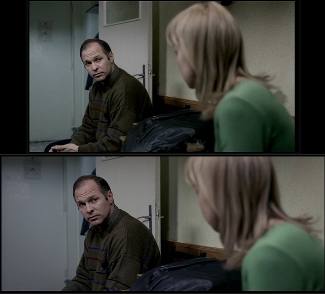
My basic reaction as I shuffled out of the screening room was “why did Soderbergh go to such an effort to make this film look ugly?” He shot it on an iPhone 7 Plus in 4K, but that’s no excuse — you can make an iPhone movie look like Technicolor VistaVision if you want. Start to finish Unsane looks drained and murky and heavily shadowed, almost in a shitty shot-in-the-’70s-on-16mm way. The two main colors are a muddy dispiriting brown and a kind of sickly institutional green, along with some buttermilk walls and the occasional haze of bluish gray.
I get it, I get it — Soderbergh wants you to feel as turned around and psychologically tormented and forcibly sedated as Foy, and the color scheme is intended to reflect her states of mind. But I was two or three steps ahead of Soderbergh in this respect. The bottom line is that, yes, I was feeling Foy’s pain and disorientation, but I was also coping with my own lethargy and displeasure. I respect Soderbergh’s decision to cover Unsane in brown murk, but I hated the palette. Sorry but I did.