
In the case of at least two relatively recent Criterion Blurays, Only Angels Have Wings and His Girl Friday, the tech guys darkened images that were slightly or distinctly brighter on previous Blurays and DVDs. Criterion has an occasional fetish for inkiness in the black-and-white realm. Two HE reviews, “Dark Angels, Black Barranca, Noir All Over” and “Inky, Grain-Smothered Friday Doesn’t Deliver Decent Bump”, complained about this.
And now, to judge by a new DVD Beaver review, the Criterion guys have gone all dark and inky on their forthcoming 4K-scanned Rebecca Bluray (due on 9.5.17).
Review quote: “Like their 2001 480p DVD, the image [on the new Criterion Bluray] is darker than [previous] digital releases. From our experience and comments from transfer specialists, ‘darker’ is usually more accurate to the theatrical presentation. You can see from the screen captures that the Criterion shows less information in the frame [and yet] the Criterion actually shows more on the top.”
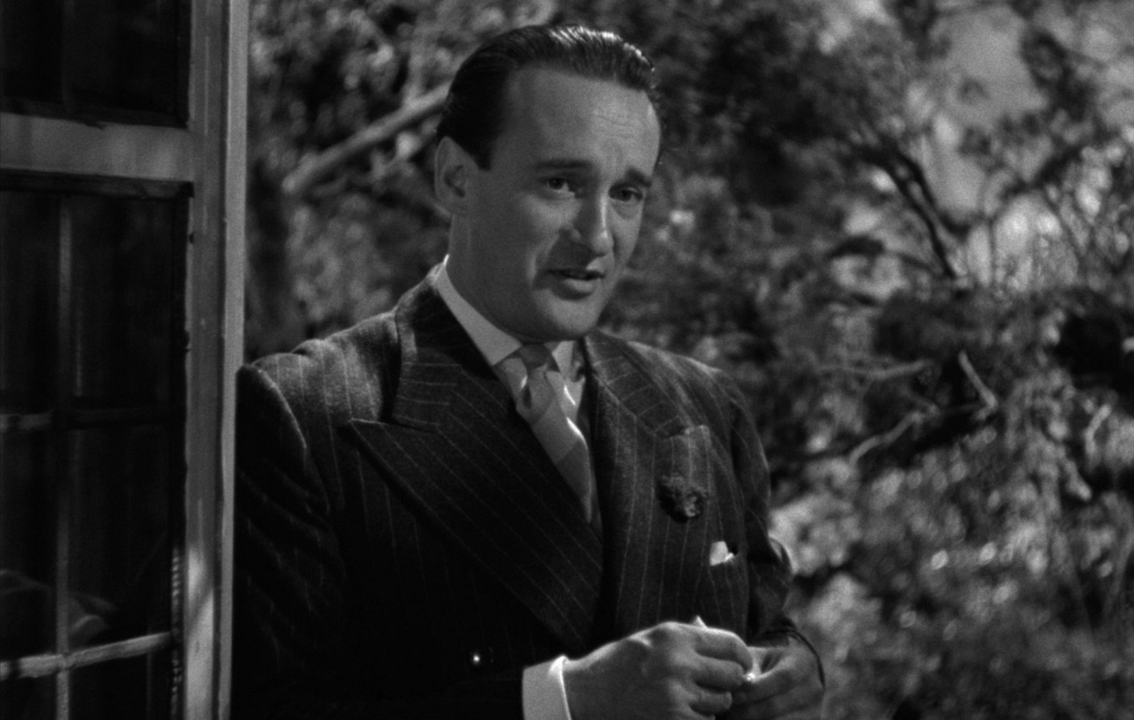
Look at George Sanders‘ Jack Favell in these DVD Beaver-captured images. The lighter version is from the 2012 MGM Bluray (which I am totally happy with — thank God there’s a fine-looking Rebecca that hasn’t been inked up) and the darker, of course, is from the Criterion. What kind of sick-fuck cineaste would prefer the darker image? It looks as if heavy thunderstorm clouds are passing over Manderley, and that Favell is about to get soaked.
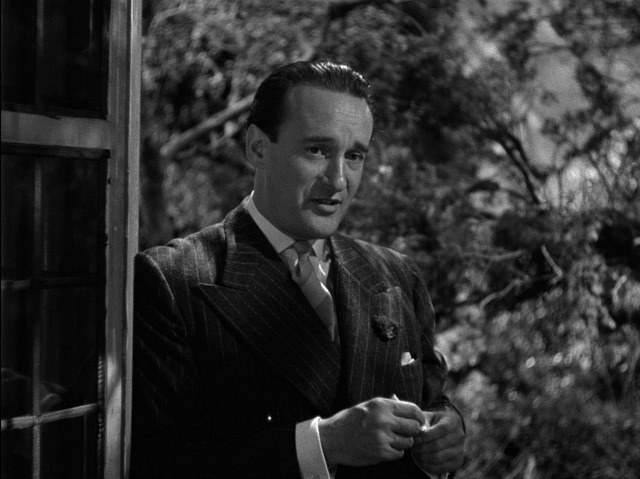 2017 Criterion Bluray version.
 2012 MGM Bluray version.
Consider also this comparison shot of a note from Laurence Olivier‘s Maxim to Joan Fontaine‘s unnamed heroine, accompanied by flower petals. In the lighter version you can see a hint of texture in the petals; in the Criterion version the texture has been all but obscured.
 2012 MGM Bluray version.
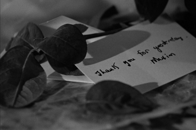 2017 Criterion Bluray version.
What is wrong with the Criterion guys and their values? I don’t give a hoot if their inky images are more reflective of what 1940 audiences saw in theatres. I don’t want things looking too bright, of course, but I obviously want to see textures and values that were captured by George Barnes‘ camera.
Why in the world would anyone argue, “Oh, no, you don’t want to see those flower-petal textures or the needle-sharp weave on someone’s tweed sport jacket or whatever. You want to notice less. What matters is that wonderful aroma of inky darkness, that gloomy shadow-bath feeling. All other considerations are secondary.”
All hail the 2012 MGM Bluray version!