HE to highly-valued web designer Mark Frenden, who’s been cooking up HE-related promotional banners and ad concepts for many years:
Date: 6.25.24
Subject: HE 20th Anniversary Ad Banners
If you could be persuaded, I’d like to cook up some HE ads or ad banners for a celebration of HE’s 20th anniversary.
The actual launch date of HE was 9.8.04, but I was working on it for many weeks before that so let’s call it August. I’d like to start posting these ads in early July and keep them around.
The concept, I’m thinking, would be (a) the standard HE logo on top, (b) the words “20th Anniversary!” or “20 Years of Verve & Attitude” or perhaps both on an alternating basis, and at the bottom of the ad art would be a Dylan quote — “Look out, kid…it’s somethin’ you did.”
I’d also (or secondarily) like to use an alternate Dylan quote — “20 Years of Schoolin’ and They Put You On The Day Shift.”
I also like “20 Years of Verve, Attitude & Arduous Sentence-Sculpting,” but that’s nine words.
Apart from the basic composing of the ads, you would be creating a colorful font for “20th Anniversary!” + “20 Years of Verve and Attitude.”’ And the right kind of visually blended caligraphy for the two Dylan quotes.
The HE ad sizes would be the usual full-width equivalent of 300 x 250 and 300 x 600. I’d like them to be 640 pixels wide and the height corresponding to this. Or you could come up with your own ad dimension.

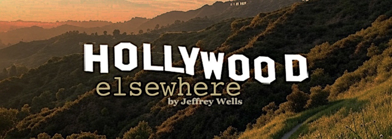
Mr. Frenden created this all-time HE classic :

