Poster designer Bill Gold, who passed yesterday at age 97, began in the advertising department of Warner Bros. The year was 1941, when Gold was only 20, and yet his Wikipage says he designed the poster art for Yankee Doodle Dandy and Casablanca, which both opened in ’42. I don’t know who was running WB’s poster design department back then, but some older person was. I’m not throwing shade, but how likely is it that a fresh-faced 21 year-old, straight out of Pratt Institute, was the sole poster designer for two major WB releases, one of which won the Best Picture Oscar?
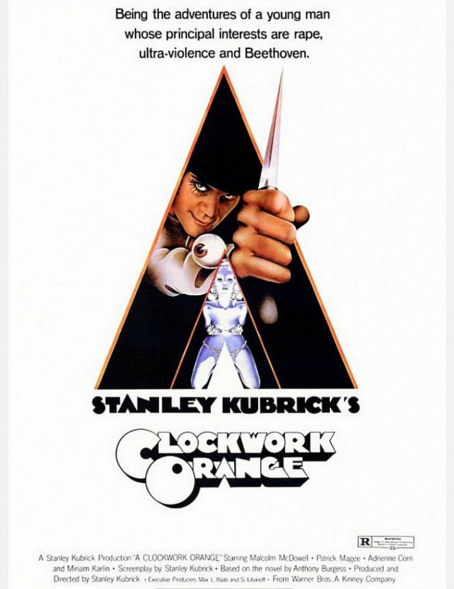
Gold was the art and concept guy for dozens of classic movie posters, but the Clockwork Orange poster, which he partially designed at age 50 or 51, was arguably his best. (The primary designer was Philip Castle.) Look at it — it doesn’t project lewd or grotesque vibes, but it almost makes the vague notion of ultra-violence and the old in-out, in-out by way of Alex DeLarge and his deplorable droogs seem almost delicious, like candy or ice-cream. Or at the very least slick and stylish, like album-jacket art for a cool band. I would argue that the Clockwork Orange poster is the greatest of all time. It’s perfect. One glance and there’s no forgetting it.
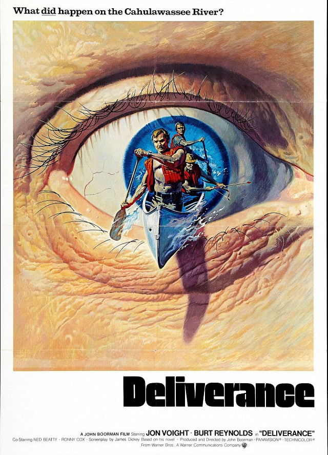
And yet Gold’s trippy one-sheet for John Boorman‘s Deliverance may be the most creatively mis-designed poster for a major studio release that I’ve ever seen. It suggests that what happened between Jon Voight, Burt Reynolds, Ned Beatty and Ronnie Cox on the fictional Cahulawassee River was a matter of individual interpretation or conjecture. Canoe-paddling out of a big eye suggests some kind of surreal or imaginary fantasy, which Deliverance certainly isn’t. The events that occur are absolutely real start to finish, and so the poster lies. Before today I’d never even seen it. So Gold gets one demerit.