
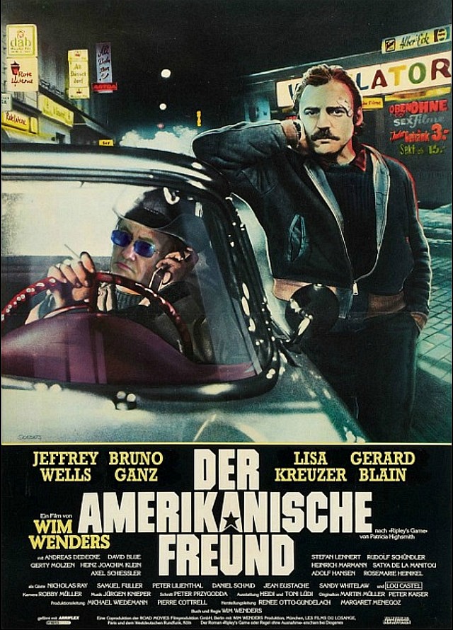
My first viewing of Wim Wenders‘ The American Friend was at the 1977 New York Film Festival, or sometime in late September of that year. Simultaneously bleak and haunting, a moody European noir, wry and cool and even sexy at times, it connects you with every existential dark-night-of-the-soul phase you’ve ever tasted first-hand in your actual life.
The late, great Bruno Ganz (with whom I felt an instant rapport during an ’04 Downfall junket interview) and Dennis Hopper gave the most iconic performance of their careers, and Robby Muller‘s chilling but wonderfully eerie cinematography…forget about it. And composed, of course, in HE’s all-time favorite aspect ratio of 1.66:1.
Several hours ago I discovered that a certain someone in our home (possibly myself) had accidentally turned on the Sony 4K’s Motion Flow viewing option, which we all understand is a huge aesthetic no-no. I realized this as I began watching The American Friend last night, not off my cherished Criterion Bluray but via HBOMax streaming.
Now the tough part: The motion-flowing of Muller’s cinematography (i.e., frame interpolation or black frame insertion) made it look extra-delicious. Sharper, cleaner, more luscious and immediate with those vaguely video-like (but mostly film-like) textures — I couldn’t get over how my love for this ace-level classic seemed to have been completely renewed.
I’m a bad person, I’m a bad person, I’m a bad person, etc.
HE to self: “This isn’t what Muller and Wenders prepared and approved. It’s a gussied-up distortion so how could you even think that it looks good on some level, whatever that level might be? Ask David Fear or Eric Kohn or any scholastically correct film critic in the country, and they’ll condemn motion smoothing to a man.”
Let me be clear that conceptually HE condemns motion-smoothing without the slightest equivocation. It’s not how films should be seen.
Except, that is, for the awkward fact that I half-loved watching the smoothed-out Friend. Not in a historical, politically attuned, get-with the program sense, but on a deep down, kid-in-a-candy-store level. God forgive me, God help me, beat me with sticks, etc.
HE commenter Brenkilco in 2015: “The ideal used to be a home experience that replicated as closely as possible the experience of watching a pristine film print projected under optimum conditions.
“But in a way we’ve gone beyond that. Digital projection of scanned film elements eliminates all print imperfections and projector jitter. HDR aided by 1000 plus nits of light output on new sets increases contrast far beyond what a theater audience would ever have experienced . Old movies were graded for 50 nits.
“The spectrum of color film still exceeds digital but the gap is closing and HDR saturation makes it hard to say which medium is chromatically superior.
“In short, older movies can now be made to look ‘better’ than they did originally. Whether they should be is an aesthetic question.”