
Yesterday the N.Y. Times online guys posted a fascinating interactive map-graph of Netflix viewing habits in 12 major cities — N.Y., L.A., Miami, Boston, Seattle, Dallas, Minneapolis, Denver, Atlanta, S.F. Bay Area, Chicago, Washington. Everything you might have suspected about the demos for various films are clearly visualized. Dark red represents the most intense interest — pale yellow and white reps low or zero interest. You can’t stop laughing.
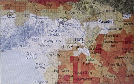
Los Angeles Netflix rental patterns for Paul Blart, Mall Cop.
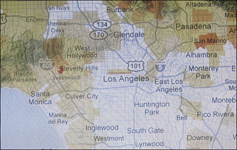
Los Angeles Netflix rental patterns for Mamma Mia. This was a hugely popular film with female Eloi all over, and yet the only dark red area is a tiny little spot in Beverly Hills. What does this tell us? That the largely female audience decided it had to be seen communally in theatres, but that it didn’t like the film enough to want to see it again in their homes? Except for women in Beverly Hills? Odd.