
We all know how most movie trailers tend to sell the sizzle rather than the nutrients — pushing the lowest-common-denominator elements with such emphasis that the trailer, in many cases, winds up ignoring what the film is really about, what it feels like to watch it, what the mood is, and so on. But the art of movie posters doing some of their own flat-out lying is pretty much a lost art. Or is it? I’m trying to remember recent examples as I write this and coming up dry.
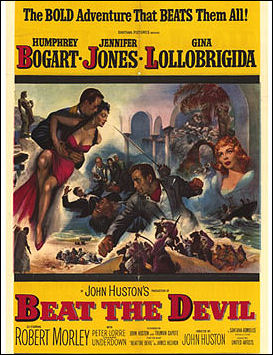
This Beat the Devil poster is a good example of the bald-faced bullshit aesthetic that was commonly deployed in the ’50s and early ’60s, and perhaps before. Beat the Devil is a clever little intellectual-conceit adventure spoof, shot in southern Italy in monochrome and enlivened by a slight sense of its own absurdity and Truman Capote‘s witty dialogue. But the Beat the Devil promised by the above poster — vivid, panormaic, colorful, erotic — doesn’t exist.
Another lying poster is this lobby card for the original 1951 The Day The Earth Stood Still, which adds a dark gray monster hand afflicted with psoriasis. Which, like, isn’t in the movie.
Can anyone think of any similar-styled movie posters used recently, or even within the last ten or fifteen years? If you can, please (a) describe the lies as clearly and simply as possible, and (b) include a link to the poster being discussed.