
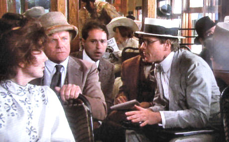
The dirty little secret of Sony Home Video’s recently-released Nickelodeon DVD is that neither of the two versions — the original color release plus the new monochrome re-do from the hand of director Peter Bogdanovich and Sony restoration guru Grover Crisp — are very attractive.
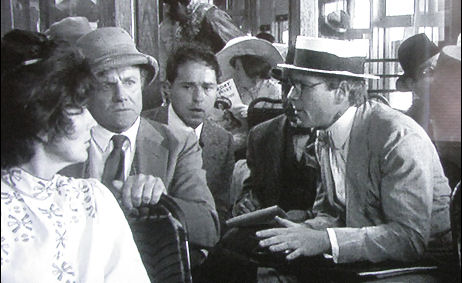
Snap of monochrome Nickelodeon as it appears on my 42-inch plasma.
Okay, the black-and-white version looks a bit crisper and more distinctive at times, but at other times it seems a wee bit murky and shadowy. Look at any old-time black and white film and you’ll notice how carefully lit everything is; how every last detail is crisp and precise and easy to eyeball. The black-and-white Nickelodeon doesn’t have this quality. It lacks that silver-nitrate polish, and looks, in fact, like a color print that’s been adjusted down to monochrome, which is more or less what it is.
On top of which this recreation of old-time, pre-Birth of the Nation Hollywood filmmaking looks wrong in a 16 x 9 aspect ratio. Bogdanovich asked for the remastering so the film would finally be seen in black and white (which is what he originally wanted when he first made it in ’75 or thereabouts) because it seems to blend with the era. But why didn’t he also push for a 1.33 to 1 aspect ratio, which is closer to how films appeared in the early days? If Bogdanovich had been a real stickler for mood and atmosphere he would have pushed for the even-boxier aspect ratio of silent films.
He shot Nickelodeon at a much taller aspect ratio anyway with information cropped off at the top and bottom; you can tell this right away from the crammed-into-a-small-space Columbia logo at the beginning.