
Updated on Saturday, 2.18, at 7 am: Peter — I’ve just had a second look at the screen captures included in Gary W. Tooze‘s DVD Beaver review of Criterion’s 4K-scanned Blow-up Bluray (streeting on 3.28), and I’m feeling a bit foolish. Yesterday [i.e., Friday, 2.17] I wrote that it seemed obvious that Criterion’s decision to go with the dreaded 1.85 aspect ratio meant that extra information has been added to the sides. That may be the case, but the frame comparisons between an old DVD image and the new Criterion Bluray [below] didn’t prove anything as they were of different frames from a shot taken from the back of David Hemmings‘ moving car. Readers pointed this out last night — my bad.
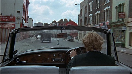
From a domestic DVD released 14 or 15 years ago…something like that.
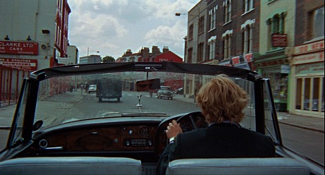
From Criteron Bluray — not the same shot.
The bottom line remains: The old Criterion organization stated on the back-cover notes for Criterion’s CAV laser disc of Michelangelo Antonioni‘s 1966 classic that the “correct” aspect ratio is 1.66. Why was 1.66 cool back then but not now? Or why not at least go with a 1.75 (which Criterion chose for its Bluray of A Hard Day’s Night) or 1.78 a.r.?
DVD Beaver‘s Gary Tooze says in his current review that the 1.85 a.r. will cause some anguish and consternation, and stated some years back that the film was definitely composed for 1.66.
I’ve stated time and again that 1.66 was a kind of default aspect ratio in England from the late ’50s to sometime in the early ’70s. Criterion’s Bluray of John Schlesinger‘s Sunday Bloody Sunday (’71), for one example, is perfectly masked at 1.66. It’s really such a shame. Back around the time of Criterion’s seminal, game-changing On The Waterfront video essay that compared the differences between 1.33 (or 1.37), 1.66 and 1.85, I thought that the case had been made that 1.85 croppings were too extreme and that 1.66 was a much more natural, liberal, eyes-of-God-and-the-universe aspect ratio. But no. 1.85 fascists are still embedded here and there, and I’m very sorry to admit that this pestilence persists.
On top of which Tooze’s observation that Criterion’s 1080p transfer is “darker than the previous DVDs, has warmer skin tones and a film-like thickness” is troubling. In what way is the look of a film enhanced by darkening the palette? Warming the color is okay within limits but why the hell would anyone want to deliver an image that looks like a screening with a dying projector bulb? And who pines for “film-like thickness”?
For the life of me I’ll never understand why the Criterion gremlins have chosen more than a few times to murk things up. The decision to go darker and inkier on Criterion’s Only Angels Have Wings Bluray was appalling — as an owner of a highly appealing Vudu HDX streaming version plus a TCM Bluray, I’ll never watch Criterion’s Bluray version again.
Question #1 — The adding of extra width to Criterion’s Blow-up Bluray may or may not be agreeable, but how do you explain Criterion staffers endorsing a 1.66 a.r. back in the ’90s vs. today’s team going for 1.85? (They couldn’t even compromise with a 1.78 a.r.?) Question #2: What’s with the darkness compulsion? — Jeffrey Wells, HE.