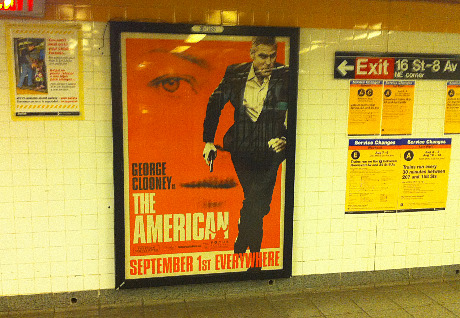
Some kind of orange fetish has recently caught on among movie-poster designers. Last night in the 14th Street and 8th Avenue station I snapped a just-mounted one-sheet for Anton Corbijn‘s The American (Focus Features, 9.1). And then this morning Awards Daily posted an OMG Posters display of various Olly Moss one-sheet designs for several classic films. Was Moss hired by Focus Features to do an American poster, or is it just what it seems — a coincidence?
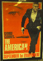
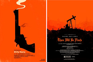
Orange has always seemed like an overly provocative color. Rude, obnoxious — doesn’t get along well with others. Splashy, splotchy. What’s orange good for besides napkins or kitschy ’50s furniture or summer dresses for older women? The fact that orange was Frank Sinatra‘s favorite color always made me think less of the guy. So I’m not a fan of orange-dominated movie posters. I never cared for that orange Vertigo poster from way back, and I’m not that intrigued by the American poster, and I think Moss’s posters for On The Waterfront and Rocky are kinda strange and what-the-fucky.
I understand that designers have to go where they want to go, etc., but let’s dump the orange at the first opportunity. Mustard…now there‘s a color!