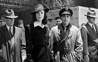
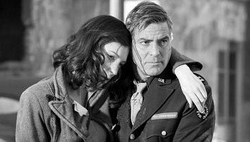
In an otherwise well-reported, technically aware N.Y. Times piece about how director Steven Soderbergh made The Good German (Warner Bros., 12.15) the old-fashioned 1940s way with black and white photography, Michael Curtiz-era lenses, boom mikes and the like, Dave Kehr doesn’t mention the most visually obvious period touch of all — the fact that German has been matted on the sides to give it a 1.66 to 1 aspect ratio rather than today’s standard Academy ratio of 1.85 to 1.

1.66 aspect ratio image, which is how The Good German more or less looks when projected…
I asked Soderbergh at Thursday night’s semi-elite media screening why he hadn’t side-cropped his film to render a boxier 1.33 to 1 image, which was the Academy standard in 1946, when The Good German takes place. “I did,” he answered, “but it seemed a little too much so we [compromised and] went with 1.66.”

1.85 aspect ratio, which is how it would look if Soderbergh hadn’t been so exacting about visual period detail.
There’s a been a conspiracy among film preservationist types to deny that 1.66 to 1 ever existed — they all say that aperture plates used in projectors of the ’50s were set at 1.85 — even if it’s obvious that standard Academy aspect ratio films of the mid to late ’50s and into the mid ’60s were intended to shown at 1.66. Every now and then you meet a smart guy like Soderbergh who says, “Yeah, of course …1.66 to 1 aperture plates were the going thing in the ’50s” but they’re few and far between. DVD companies have commonly masked films of this era with a 1.66 aspect ratio, but the preservationists continue to pooh-pooh it, like it’s a fantasy concept or something.
