
I’ve explained two or three times that orange is a bad color to use in ads, movie posters and/or DVD/Bluray covers. I mentioned this in a recent riff about a British Touch of Evil Bluray. And I wrote last August that “any emphatic use of orange feels a bit oppressive” because “it’s a safety color when you’re hunting or working construction or standing on a busy traffic road in the evening, but it’s also a control color — a symbol used to enforce rules and segregate prisoners and make people stay within boundaries.”
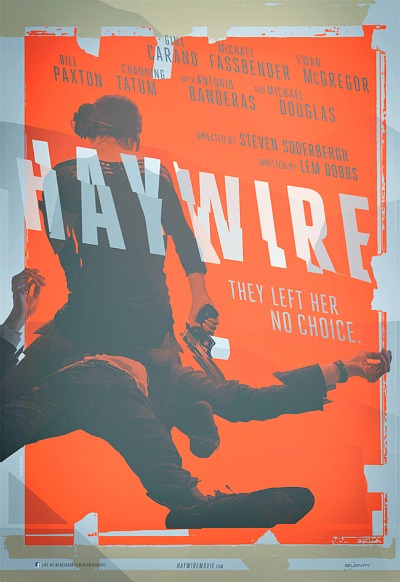
Orange doesn’t say “life can occasionally be beautiful or transporting.” It says “do this,” “watch out,” “don’t go there,” “slow down,” etc.