A MOMA-supplied 35mm Technicolor print of King Vidor’s Duel in the Sun (‘46) screened this afternoon at the Lincoln Center Film Society’s Walter Reade theatre, and man oh man oh man…they got me.
The images were so dark and murky you could only see about half of what had been captured by dps Lee Garmes, Ray Rennehan and Harold Rosson. The rest, it seemed, was hiding in shadows, smeared with lentil soup, covered by a scrim.
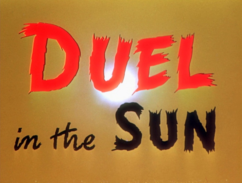
Even the brightly lighted Technicolor Selznick logo sequence (the Gone With The Wind Bluray delivers a perfect rendering) looked like it was shot during a solar eclipse.
I was told by management that it wasn’t a case of poor illumination (the projectionist told a theatre employee that the image was lit by 16 foot lamberts) but a dark–ass print. Besides the lack of sharpness (the clarity difference between Duel and GWTW is like night and day), the cinematography had a generally thick and heavy quality. Nothing looked beautiful; it was horrendous.
I got up and left around the 40-minute mark. “Why am I watching this?” I muttered to myself. “I feel like I’m going blind.”
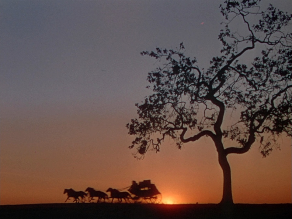
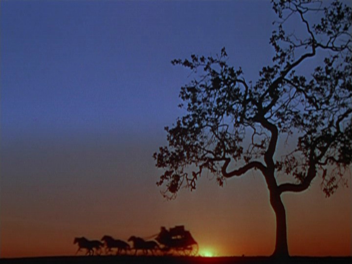
These DVD Beaver screen captures from a 2017 Kino Bluray simulate the difference between a properly illuminated Duel in the Sun image (above) vs. how it looked inside the Walter Reade (below) — the projected images actually looked worse than this.
The projected main title sequence looked dark and muddy — it didn’t pop in the slightest. This is how it should have looked (but didn’t):