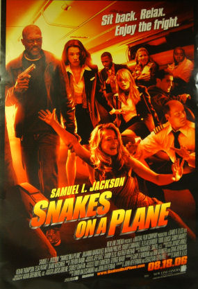
I called my New Line pallies and apparently this is the approved wide-release poster for Snakes on a Plane (as opposed to the teaser poster). I’m sorry, but it doesn’t make it. It’s not dry or hip enough. In fact, it seems to be trying to make the movie look un-hip by appealing to the Rhodes scholars who need to be told there’s a satirical element…those who haven’t visited Snakes on a Blog or listened to any of the theme songs or watched any of the video spots.

And wipe that steely smile off Samuel L. Jackson’s face …please. And dump that “Sit back…relax…enjoy the fright” slogan. A poster that winks this broadly is totally the wrong way to go.
The only way to sell this movie is as a straight thriller. If you’re making a thriller with yucks and smirks, fine…but never ever say to an audience that this is what you’re doing. Conceal your motive and your agenda at all times. Let the audience discover it (and they’ll love you for it). If there’s something to laugh or chuckle or smirk at, they’ll decide.
Unless it’s already been mass-produced and mailed to theatres, the fact that this poster sucks isn’t the end of the world. New Line marketers just need to suck it in and admit fault and send the art guys back to the drawing board. Wait a minute…a guy named Colin just wrote in and said he saw this poster hanging in a theatre near Union Square.
