
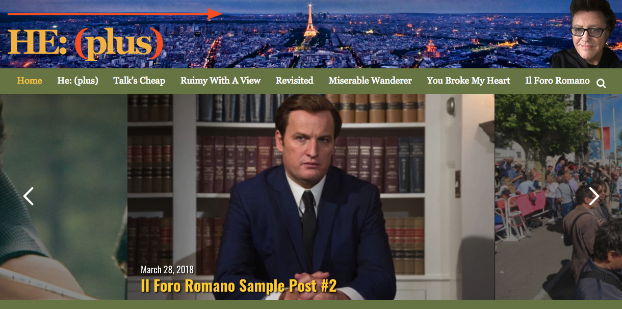
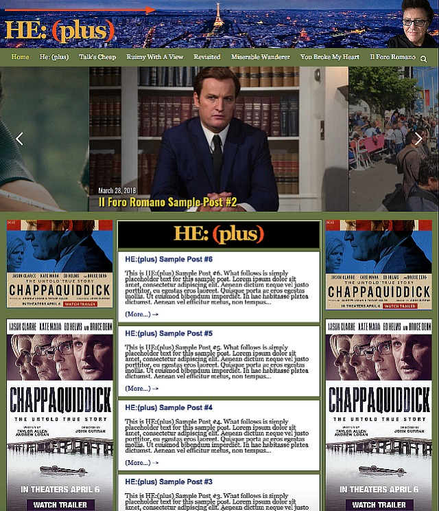
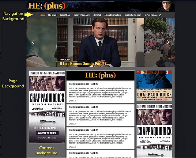
The great Dominic Eardley and I have been futzing around with the flavor and ornamention of the new HE:(plus) design. A friend urged me to make HE:(plus) look different and distinct from HE classic. So I decided to substitute the Hollywood hills backdrop for one of Paris…Hollywood Elsewhere, right? And then stealing Francis Bacon’s occasional use of arrows in some of his paintings, except make the arrows red and pointy and very, very narrow. I also decided to change the content area background from medium gray to olive drab, and the background area from dark gray to mineshaft black.
The other HE:(plus) columns besides my stuff (Ruimy With A View, Il Foro Romano, Miserable Wanderer, etc.) will line up below. The individual logos for each column are being designed as we speak by HE’s own Mark Frenden. This is not the end-all and be-all of HE:(plus) design, of course, but a beginning. If anyone has any suggestions or improvements, please share. Again, the basic layout so far.