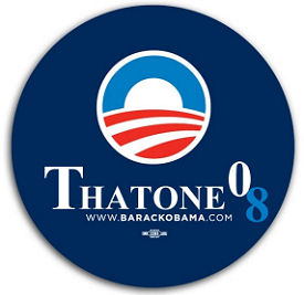
I love this. I certainly respect the speed factor — it was up two or three hours after the close of last night’s debate — but the art isn’t quite right, dammit. The capital “t” and “’08” don’t seem proportionately rock ‘n’ roll. Trying to figure why “amost”-level logos and style designs don’t work can drive you nuts. Someone should re-do it and get it right and then the buttons, bumper stickers and whatnot could begin to circulate. For fun, I mean. A keepsake.