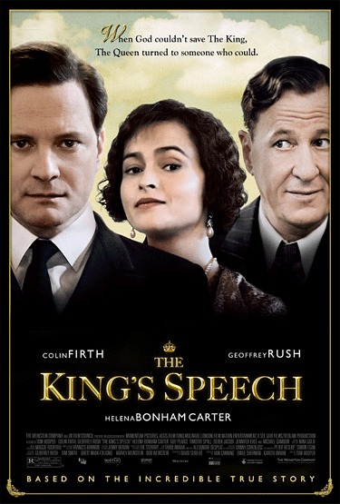
Is it that hard to create a movie poster that makes it seen as if the lead actors actually posed together in the same realm? Whoever did this King’s Speech one-sheet for the Weinstein Co. didn’t try hard enough. Colin Firth and Helena Bonham Carter “agree” to some extent, but the incongruent pasting of Geoffrey Rush reminds me of the quality of international action-flick posters that I’ve seen at the American Film Market.

And why didn’t these three pose together in costume during filming? It used to be a relatively common practice.
Incidentally: Movieline’s Stu Van Airsdale dislikes this poster even more than myself.
