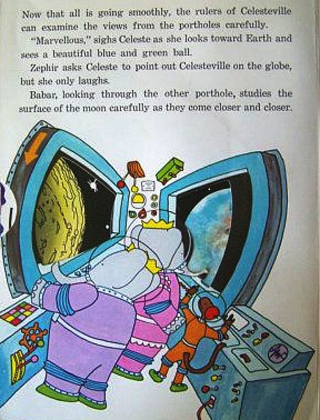
There’s this tendency among web designers to use large-point-size type and acres of white space. I really hate this, and this morning I told good friend Sasha that Hollywood Elsewhere’s redesign will not follow the Babar and Celeste thematic approach. This was three or four hours ago, mind. We’ve since moved past the Babar-and-Celeste thing but for a while there I was very concerned. I’m sorry but web design disputes make me emotional.
“I do not want and will not stand for a Hollywood Elsewhere designed for four year-olds — readers who need the point sizes to be gargantuan and web pages that revel in acres and acres of pointless white space.

“I want the copy and point sizes of the new Hollywood Elsewhere (which was created to make it feel less ‘old’ and revitalize advertising and make the site load faster) to look sensible and balanced and elegant. I don’t want it downgraded. I want it to look handsome and balanced and respectfully old-world in the sense that N.Y. Times or Forbes or Vulture copy looks, or how the current HE looks. I hate how it looks now.
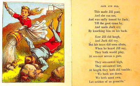
“The old (current) HE is unremarkable but palatable — the point size of headlines and copy are okay — they don’t leap out but are at least proportionate, unchallenging and sensible. If they seem too small, the reader can use his/her fingers to increase image size. The current redesigned version looks awful on mobile. The headline point size is gargantuan. And the general copy point size is also too big. It looks like a child’s reading book.
“I’m going to say this over and over until it happens. I want the point sizes of headlines & copy to be roughly the same as they are on the old HE. I want the generally balanced & elegant look of the current site preserved. I don’t care if we’re ignoring current aesthetic trends. I want HE to look balanced and sensible and non-extreme. I would rather collect garbage for a living than create a site that resembles a Babar & Celeste book. I will not approve an uglifying of my life, of my site, of years refinement and simplicity.
