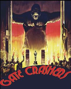
Mark Frenden’s GATE CRASHERS logo and title treatment is 90% satisfying. Because the red title is off-balance and a bit oddball— it doesn’t quite stand up to the big funny ape. And we don’t really need the Oscar statuette. Am I wrong?

Mark Frenden’s GATE CRASHERS logo and title treatment is 90% satisfying. Because the red title is off-balance and a bit oddball— it doesn’t quite stand up to the big funny ape. And we don’t really need the Oscar statuette. Am I wrong?