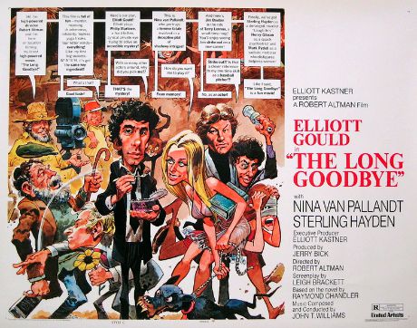
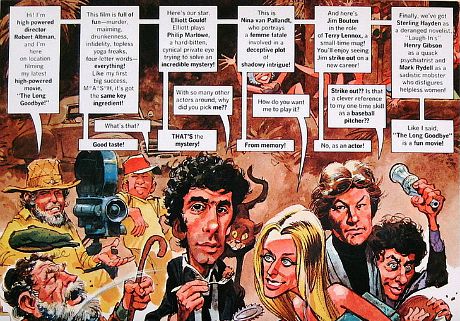
It occurred to me this morning that Jack Davis‘s legendary Long Goodbye poster (which was drawn, of course, in the Mad magazine illustrator’s trademark style — big heads, spindly legs, big feet) was an early print version of the playfully critical style of Honest Trailers. Except the dialogue balloons in Davis’s poster aren’t that playful — they’re bluntly critical by suggesting that The Long Goodbye is a coarse, somewhat tasteless film with a less than stellar lead (i.e., Elliott Gould) and a cast of curious eccentrics, two of which are portrayed by Hollywood interlopers (Nina van Pallandt, Jim Bouton). It was almost a warning to the none-too-hip crowd of 1973 that they might want to see something else. I’ve always worshipped the Davis poster but a smart one-sheet always appeals to the dolts along with the hipsters. What other theatre-lobby posters have suggested to Average Joes that they might not want to patronize this or that film?