The redesigned Hollywood Elsewhere, which may pop later today or tomorrow, has a wider column width than the classic version. HE classic photos were 460 pixels wide; the new HE will features photos that are 640 pixels wide. Which is no biggie as far as future posts are concerned, but every jpeg photo in every previous post (August 2004 to May 2017) is going to be sitting flush left with a big dumb white space sitting to the right. All notions of eye-pleasing balance will be out the window.

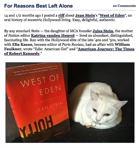
The way jpegs and posts have looked on this site for nearly 13 years — the image perfectly balanced in accordance with the width of the column.

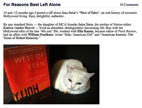
The way these same jpegs will look henceforth — 13 years of painstaking effort desecrated.
I can’t resize 13 years worth of photos but I’d to at least try to figure out if I can center them within the new wider (640 pixel) posts. The flush left thing is AWFUL. I’m told that a solution may be found in WordPress, that I can make “sweeping changes” to the style template I’ve been using. “But if you enter them manually those sizes are set by you,” I’ve been warned. “And they remain set by you.”
I don’t want to fuck with WordPress settings — I’m too much of a klutz. Which basically means that I’m fucked, or at least that the solution to this too-small, flush-left problem is unknown as we speak.
“Great — so the past is ruined,” I replied. “The symmetry and balance of what was seen before will be erased and forgotten, and the visual reputation of Hollywood Elsewhere between August 2004 and May 2017 will be fucked into eternity.”
Answer: “No one gives a damn about it, trust me. They care about the now. They care about information, access and pulling one of your images to use for free on their site. You’re hanging onto something that will sooner or later be completely gone from the internet. The content is what matters — not the images, not the design.
“If you want to pay some kid to go through your images one by one and resize them, go right ahead. But the past is the past, and nothing lasts forever. If the images are there, that’s a huge improvement. Most sites get rid of their images entirely to save disk space. It just clutters up the internet with images people don’t care about.”
Incidentally: Classic HE ad spaces are blank is because the ads are all pointed at the new site.
