
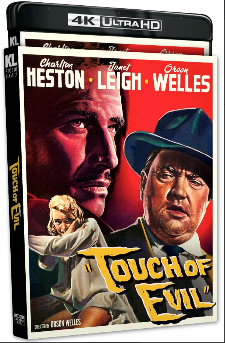
HE to Kino Video regarding upcoming Touch of Evil 4K Bluray (streeting on 2.22.22): As you guys presumably recall, England’s Masters of Cinema / Eureka Video released two versions of a Touch of Evil Bluray in two aspect ratios — 1.85 and 1.37 — roughly a decade ago.
A Kino Lorber spokesperson has confirmed that their forthcoming 4K version will be formatted only in 1.85.
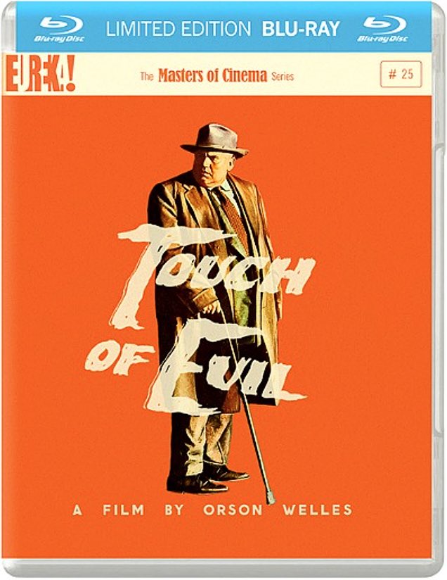
In November 2011 Eureka Video released a Bluray of Orson Welles‘ Touch of Evil (1958) with five different versions of the film.
We’re actually talking three versions of the film, two of which are presented in both 1.37 and 1.85 aspect ratios and one (the 1958 pre-release version) presented in 1.85 only. The 1998 reconstructed version, running 112 minutes, that was put together by Walter Murch, Bob O’Neil and Bill Varney, is presented in 1.37 and 1.85.
Two aspect ratios for both versions is so hardcore, so film-nerdy…your heart goes out to people with this much devotion.
But the orange jacket-cover backdrop is, for me, a problem. To advertise a revered classic film taking place in a Mexican border town and shot in the gritty environs of Venice, California, Eureka chose one of the most needlessly intense and eye-sore-ish colors in the spectrum? A color that says traffic cones and prison jump suits?
Posted on 10.16.09: The answer to the Touch of Evil aspect-ratio controversy contained in the release of the 50th anniversary DVD is simple, and shame on those who would needlessly complicate it. All 1950s film that were captured with a protected aspect ratio of 1.37 to 1 should always be mastered for DVD at that aspect ratio. Or at least at 1.66 to 1. I can’t over-emphasize how despicable I find 1.85 to 1 croppings of Eisenhower- and Kennedy-era films.
There is no aesthetic benefit at all — zero — to chopping the tops and bottoms off an image that was protected for 1.37 to 1. The reborn Gordon Gekko’s new slogan: Tall and boxy is good. It harms no one to release a taller fuller image. The DVD distributors are simply looking to put out an image that fits within 16 x 9 aspect ratio of high-def plasma and LCD screens. They want everything to be “wide.”
Don’t believe so-called experts who claim that 1.85 was the projection norm in the ’50s — it wasn’t absolutely. It was 1.66 to 1 here and there, and 1.85 here and there; it was even 1.37 here and there. Why have so many ’50s and ’60s films been masked for laser disc and DVD at 1.66 to 1? For the hell of it? Remember the travesty of Shane, shot in 1.33 (or 13.7) to 1, and then projected in theatres at 1.66 to 1 to accomodate the then-new appetite for wider-screen imagery? The same kind of revisionist horseshit has been happening for years in the DVD market.
HE reader Robert Hunt contends that Hollywood historian Richard Maltby, writing in his book “Hollywood Cinema” (which I’ve read but have no copy of right now), argued that “1.85 wasn’t accepted as the standard aspect ratio by the SMPTE until 1960.”
Some Came Running‘s Glenn Kenny was written about this in a fashion that I find a little too laissez-faire. Here it is:
“The facts are these: Director Orson Welles and cinematographer Russell Metty shot Touch of Evil in the so-called ‘Academy ratio’ of 1.37:1. And…well, actually, as far as the universally accepted facts are concerned, that’s where they end.
“There is plenty of documentation attesting that it was Universal Studios policy, mid-1953 or so, to have all their releases theatrically projected at the wider 1.85:1 ratio, via a ‘hard matte’ (a plate with a rectangular opening placed in front of the projector’s lens), with the Academy ratio reserved for TV airings of films (1.37 fitting almost exactly correctly on old-style television screens).
“Kehr’s commenters include a great number of folks who have seen Touch of Evil screened theatrically at 1.37. Did the projectionist make an error? Is the documentation concerning Universal’s policy wrong? Did Welles and Metty compose for 1.37 without realizing that the film would be projected at 1.85?
“A lot of questions with no, apparently, definitive or cut-and-dried answers. What is sure is that the new Touch of Evil edition offers three versions of the film–the compromised but still absolutely classic theatrical release, a ‘preview’ edition that hews closer to Welles’ vision than the eventual theatrical release, and the ingenious, controversial 1998 ‘restored’ version put together by scholar/preservationists Rick Schmidlin and Jonathan Rosenbaum — all in 1.85. Former Cahiers du Cinema critic Nicolas Saada calls this a ‘disaster’ over at Dave’s site.
“A host of others, who are also discussing the decision over at the Criterion forum, point to the evidence apropos Universal’s policy. The Lafayette Theater’s Pete Appruzzese, a man I defer to in all manners technical, says he’s run Touch of Evil in both 1.37 and 1.85 and that to his eye the 1.85 version is correct. Dave Kehr feels the 1.85 version looks ‘tight.'”
Then again Kenny wrote the following within Kehr’s talkback section: “Let’s start a collection to raise enough money so that Craig and the MOC guys can convince Universal to license them Touch of Evil for a Blu-ray MOC release in 1.33. Put me down (seriously) for $500 in support.”
Here’s a German comparison site, copied from Dave Kehr’s TOE page.
There’s no earthly reason to believe or presume that Welles and Metty would have preferred that Touch of Evil be seen by future generations in a 1.85 to 1 aspect ratio. Any idiot can look at the 1.37 version on tape and the new cropping and come to this conclusion. There is a word for the 1.85 cropping on the just-out three-disc DVD set, and that word is “vandalism.”