Jeff Goldblum doing the same thing to his T-Rex pursuer that Steve McQueen did to the two “organization” assassins at the beginning of the San Francisco chase scene in Bullitt. Major market TV ads (Superbowl, Oscar telecast) don’t get much better than this. On the same level as Joe Pytka’s 2005 “I’m Spartacus” Pepsi spot.
Daily
Steers Invading The Compound!
“We’re not gonna take it! / No, we ain’t gonna take it! / Oh, we’re not gonna take it anymore!” — anthem of the long-horned steers who rebel against the Westworld owners and engineers in Season 2, which launches on 4.22.18.
From “Westworld Hate Will Continue To Spread,” posted on 12.5.16: “Like many others, I’ve gone totally negative on Westworld over the last three or four episodes. The HBO miniseries finally ended last night, but that doesn’t mean there isn’t a major revolt going on. I hate this series with a passion for just layering on the layers, for plotzing, diddly-fucking, detouring, belly-stabbing, meandering and puzzleboxing to its heart’s content.
All Dwayne Johnson Films Blow Chunks
Die Hard meets The Towering Inferno with Dwayne Johnson, a possible contender for the Republican presidential nomination in 2024 or even ’20, leaping off a construction crane 85 floors up in hopes of landing in a windowless area in a nearby skyscraper. Plus he’s wearing a prosthetic left leg. Plus he’s a family man who needs to clear his name like Denzel Washington did in The Taking of Pelham 123. And with Rawson Marshall Thurber at the helm!
With the exception of Michael Bay‘s Pain and Gain, Johnson has demonstrated time and again that he’s fundamentally opposed to appearing in films that are (a) good and (b) at least semi-believable. He makes big, dopey, adolescent cartoons. Jumanji: Welcome to the Jungle was a perfect fit. Originally posted on 12.8.16: “If Dwayne Johnson Is Starring, It’s Probably Empty, Glossy Dogshit.”
Hey, Wait A Minute…
He calls himself Han Solo, but his voice, though residing in the deeper registers, has a kind of thin, reedy quality. Don’t tell me this guy is Han Solo because he’s not.
He’s around four inches shorter than Harrison Ford, for one thing. Sure, he’s trying to generate the old cavalier swagger and is half pulling it off, but his eyes are dark and drill-bitty and he’s, well, you know, Jewish. All my life Han Solo has been a tall, WASPy, casual-frat boy-with-an-attitude, but now he’s suddenly a 5′ 9″ Rabbinical student with narrow shoulders, doing his best to give off that devil-may-care and offering a passable substitute, but he’s not Han Solo.
In late 1942 Humphrey Bogart appeared on the screen as Richard Blaine, a sly, cynical, broken-hearted owner of a popular saloon in Casablanca. Forty years later David Soul played the same character in a 1983 one-hour TV series called Casablanca. For some hard-to-fathom reason the series was yanked after only three airings.
Guillermo Locks Best Director Oscar
My secret hope-of-hopes has been that the top two Oscar prizes would be split — The Shape of Water‘s Guillermo del Toro winning for Best Director but something else winning for Best Picture. Like, for example, Greta Gerwig‘s Lady Bird. Because Lady Bird, at least, is one of HE’s three best films of the year, the other two being Dunkirk and Call Me By Your Name. But my spirit is wilting.
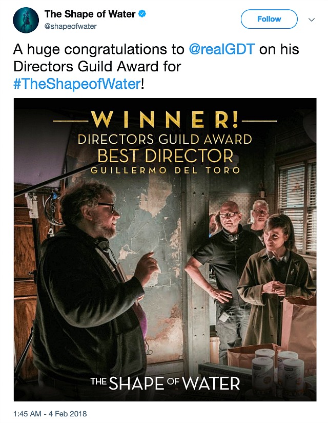
The Best Picture Oscar will probably go to The Shape of Water with Martin McDonagh‘s Three Billboards the principal alternate winner. Last night Del Toro won the Directors Guild of America’s top feature prize; Get Out‘s Jordan Peele won the Best First-Time “Woke” Feature Director trophy (or whatever it’s called).
Tarantino’s Feet Being Held To Hot Coals
From Owen Gleiberman’s “Drive, He Said” Variety essay: Quentin Tarantino “certainly needs to address the Kill Bill car scandal in a far more detailed and confessional manner. Because he’s in the murky middle of it, obviously, but also because Tarantino is in a position to shed light on how the vertiginous power dynamics of Hollywood operate, and how they might now change.
“There’s no denying that the car incident didn’t just happen out of ‘negligence.’ It was the result of a recklessness, an arrogance, a so-ingrained-it’s-taken-for-granted pattern of unchecked aggressive male dominion in the film business. Seen against the backdrop of #MeToo, against the pileup of accusations and a landscape that’s shifted, overnight, to a policy of zero tolerance, the Kill Bill incident looks, perhaps, like a second cousin of harassment: the cold exploitation of talent by those who surely knew better.”
Beauty and Duty
“My dream is to retire. That’s not a one-liner; it’s true. To spend every year of your life with the abstraction of making a film, with a crew of 200 people and their passions and their stupid priorities, the pressure of having to deliver, the pressure of spending other people’s money and having to be nasty because you don’t want to give up your integrity? And then to show your film to the world and to have to talk about it and repeat your answer to the same questions again and again…? I used to see making films as a kind of paradise and I now realize it’s kind of a hell, to be honest.” — Luca Guadagnino in the fall/winter 2017 edition of Fantasticman.
I don’t know how many other directors share Guadagnino’s attitude, but he’s one of the very few with the balls to share it in a public forum. He’s said before that he could be happy doing something other than directing. I don’t entirely believe him. Being a hotshot, world-class director opens up so many doors and opportunities, after all. And Gudagnino is one of the few directors I would describe as genuinely happy and even joyful about his life, despite all the alleged negatives.
I say this as one who could never be where Luca is. I see life in terms of struggle and duty and working your fingers to the bone. “I went to sleep dreaming life is beauty / I woke and found that life is duty.”
It all boils down to that Robert E. Lee Pruitt line: “A man should be what he can do.” Whether it makes you happy or not is beside the point. A gift or a special ability has to be nurtured, developed and applied. Failing to do this is not only shameful but tragic.
“No Cars in Star Wars!”
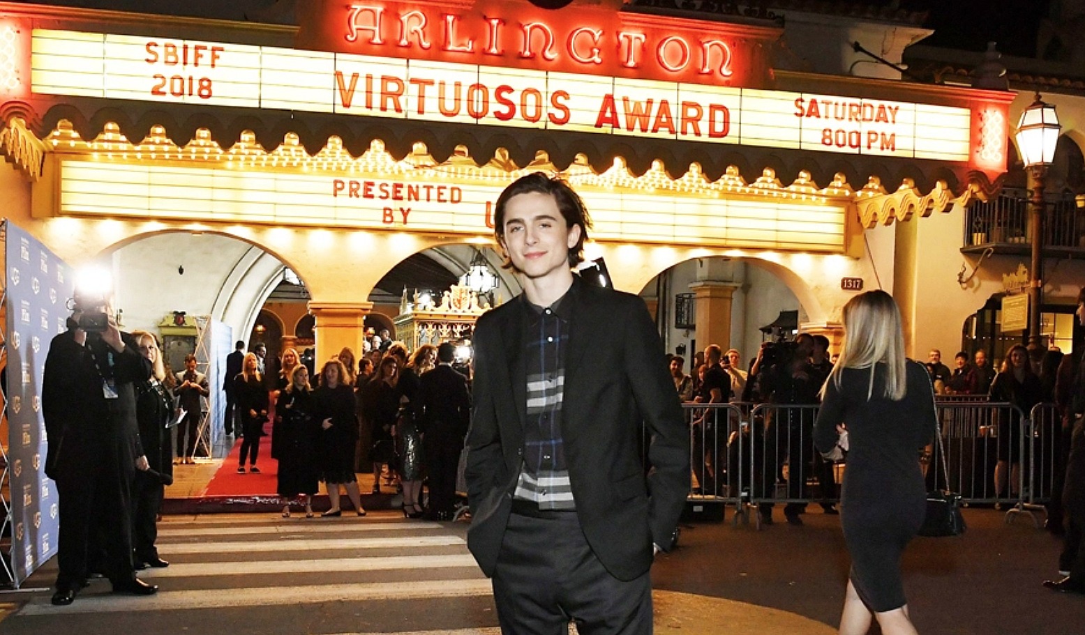
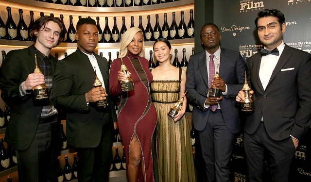
Last night’s Virtuosos celebration at the Santa Barbara Film Festival — moderated by Dave Karger, attended by Kumail Nanjiani (The Big Sick), Timothee Chalamet (Call Me By Your Name), Daniel Kaluuya (Get Out), Hong Chau (Downsizing), Mary J. Blige (Mudbound) and John Boyega (Detroit) — was easily the loosest, funniest and most spirited I’ve ever witnessed, and I’ve been watching Virtuoso events since whenever they began. Nanjiani and Chalamet were the stand-outs, closely followed by Kaluuya.
I love Najiani’s comic attitude — dry, droll, blunt. 100% truth, incapable of gush.
I exchanged greetings with Chalamet at the after-party, and I was kind and considerate enough not to mention his recent decision to throw Woody Allen under the bus. I understand why he went along with the mob on this one. He has a career to protect and obviously needs to be in league with the cool kidz. It’s very easy to stand outside the arena on Monday morning and say “I would’ve acted differently or more thoughtfully” or what-have-you.
By the way: Nanjiani said he’ll be starring in a “low-budget” thriller for director Ferdinando Cito Filomarino, whose 2010 short, Diarchia, I happened to see last year. I personally know Filomarino as “Ferdy” via HE’s own Luca Guadagnino. Nanjiani didn’t mention a title, but it’s set in Greece and will begin filming in August, he said. Contracts are being ironed out as we speak.
Only In It For The Money
SNL‘s “First Lady” sketch was, at best, mildly amusing, or not actually funny. To laugh “with” Cecily Strong‘s Melania Trump you need to have at least a measure of sympathy or compassion for the actual “Slovenian sphinx,” as Maureen Dowd described her on 1.27. The woman is a scruple-free opportunist, matrimonial arm candy for hire. I’ll respect Melania when she walks and sues for divorce sometime before 2020. As Kate Mckinnon‘s Hillary Clinton reminds her, “You married him.”
Natalie Portman‘s Jackie Kennedy: “Jack cheated on me with Marilyn Monroe.” Strong’s Melania: “Oh please. She was in Gentlemen Prefer Blondes. Donald’s girl was in Guys Like it Shaved.”
The Art of Softball Questioning
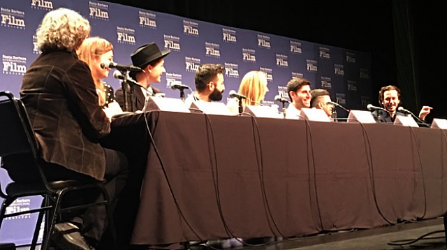
Every year the Santa Barbara Film Festival presents a panel discussion among screenwriters. It always happens on the festival’s first Saturday at the historic Lobero theatre. Indiewire‘s Anne Thompson has been hosting this event for the last several years, and the sense of deja vu is very pronounced because it’s always the same softball session.
The screenwriters are given a chance to tell their stories in an amusing or colorful way and everyone has a nice easy time, and sometimes questions from the audience are allowed. But nobody ever pokes or prods.
Nobody asked Shape of Water screenwriter Vanessa Taylor why she and Guillermo del Toro decided against defining Doug Jones‘ Aquaman in any way you’d remember — no personality, longings, traits. Nobody asked The Post‘s Liz Hannah about the major Oscar-bait headwind that her film enjoyed before it was screened, and how it all collapsed when Steven Spielberg‘s film was quickly elbowed aside by the critics group and the guilds. Nobody asked Baby Driver maestro Edgar Wright about why he folded his campaign after the Kevin Spacey scandal. Nobody asked The Disaster Artist‘s Michael Weber about the sudden torpedoing of director-star James Franco over alleged sexual misconduct.
Every side-angle or hot-button question was avoided like the plague. But that’s why we enjoy this panel each and every year.
Respectful Avoidance
In Andrew Wagner‘s Breakable You, Holly Hunter (The Big Sick) is a newly divorced therapist who becomes romantically involved with her plagiarizing playwright ex-husband’s brother. I’m okay with Tony Shalhoub as the ex (as long as he keeps his shirt on), but Alfred Molina is a no-go as the amorous brother. There are actors you never want to consider or imagine in an intimate context, and Molina, no offense and God bless him, is one of them. Just as audiences of the ’30s, ’40s and ’50s never wanted to contemplate Charles Coburn in a sexual light. Brian Morton’s source novel was published in 2006.
God Is A Concept
I had a traumatic birth, which gives you a certain antsy outlook on things. By the time I was six or seven I was feeling very angry at God for giving me such a miserable life in suburban New Jersey, and especially for giving me such strict, hard-nosed parents, particularly a mother who made me go to church every damn Sunday. In my tweens and teens I went through a period of mocking and taunting Him. Then I embraced and worshipped Him as a result of my mystical LSD trips in my early 20s. Then I came to an understanding that God is, depending on how lucky or unlucky you are in terms of parental or tribal lineage and birth location, at best impartial about whether you’re living a happy or miserable life. It’s up to you. If you want happiness and you’re not living under a horrible dictatorship, orchestrate your own version of happiness or fulfillment, being careful not to make things worse for others.
