Award-season films are suddenly dropping like flies. It began with the date-shifting of Grace of Monaco. Then the discrediting of Diana (which no one ever thought was going to be good, much less exceptional). Then the possible postponement of Martin Scorsese‘s The Wolf of Wall Street (please, please stay the course, Paramount!). And now Bennett Miller‘s Foxcatcher — a 12.20 Sony Classics release that’s been drop-kicked into 2014. Look at the trailer, for God’s sake. Solemn mood, refined chops and what is clearly an exceptional, possibly nominatable Steve Carell performance. (Plus a very interesting one from Channing Tatum.) The season has just become less interesting, less dimensional. One less highly nutritious film for December. (I’ve read the script — trust me.) I for one feel cheated, shortchanged. If I were Carell right now I’d be punching the refrigerator door like nobody’s business.
Daily
Seen From Flying Aircraft

Tony Tasset’s 94-foot-tall rainbow arch on the Sony Studios lot was erected almost a year ago, but I wasn’t paying attention or whatever. Last night I noticed it for the first time when I drove on the lot through the Thalberg gate for a screening of Alex Gibney’s The Armstrong Lie.


The End
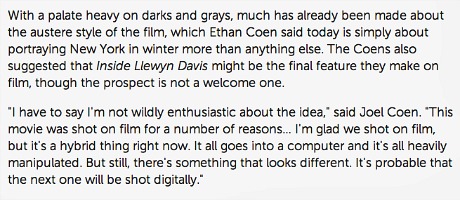
From Brian Brooks’ 9.26 Indiewire account of the Inside Llewyn Davis press conference, held at the New York Film Festival’s press venue, the Walter Reade theatre. Here, by the way, is Marcus Mumford and Oscar Isaac‘s cover of folk classic “Fare Thee Well (Dink’s Song),” which is heard at least a couple of times (thrice?) in the Coen brothers film. We’ll have to wait until 11.12 for the official Davis soundtrack and especially “Please Mr. Kennedy,” which, when performed by Isaac, Justin Timberlake and Adam Driver, is easily the most conventionally entertaining moment in the film.

Plain Spoken Inequality
Jacob Kornbluth‘s Inequality For All (Radius/TWC, 9.27) , which I first saw nine months ago in Park City, is easily one of the smartest and most articulate docs of 2013. A profile of economist and former Labor Secretary Robert Reich, it explains with cool clarity how the game has become more and more rigged by the rich since the Reagan era, and why so many wage-earning middle-classers (including Tea Party lowlifes) are feeling so shafted and angry these days. Everybody knows the dice are loaded. Everybody knows the fight is fixed. The poor stay poor, the rich get rich. That’s how it goes. Everybody knows.

(l to.r.) Inequality For All director Jacob Kornbluth, The Newsroom creator Aaron Sorkin, Inequality star Robert Reich at last night’s post-premiere gathering in Manhattan. (Photo: Shannah Laumeister.)
Each Dawn I Die
You could say that Alex Gibney‘s The Armstrong Lie (Sony Classics, 11.8), which I saw a good portion of last night at Sony Studios, is only nominally about the ethical outing of Lance Armstrong, the competitive cycling superstar who won the Tour de France seven times (between 1999 and 2005) only to be stripped of his titles in 2012 for doping and thereby exposed as an opportunistic liar. The film is really about the worldwide belief system known as moral relativism, which basically says “it’s not cool to lie or cut corners or cheat or steal, but if you do these things…uhhm, well, you wouldn’t be the first and…uhhm, if they come after you it’s probably better to deny, deny and double-deny and give them no quarter until there’s absolutely no viable option other than to come clean. And you can even grow that into a plus if you play your cards right and wear the right attitude (i.e., I was blind but now I can see).”

Long of Tooth
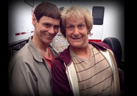
When Jim Carrey and Jeff Daniels costarred in the Farrelly Brothers’ Dumb and Dumber (’94) they were roughly 32 and 39 years old, respectively. Obviously not spring chickens but relatively buoyant, fresh-faced, elastic of bod. Now they’re costarring in the Farrelly’s Dumb and Dumber To, which I suspect will be funny and inventive (I was a fan of the Farrelly’s Three Stooges flick), but now we’re talking about a 51 year-old and a 58 year-old playing the same characters. Dumbasses in their 30s vs. dumbasses in their 50s are different equations. You’re supposed to mellow down and gather a little wisdom out as you get older. You can fall into dumb-shit situations when you’re youngish but guys with creases on their faces are supposed to be craftier and less susceptible.

“But She Did Not Show”
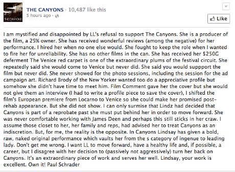
The following was posted on Facebook by The Canyons director Paul Schrader this morning, roughly five or six hours ago or around 7 am. In the lead-up to The Canyons Lohan had a chance to present a composed, sober-seeming version of herself but she (a) bailed on the Venice Film Festival, (b) never showed for ad photo sessions, and (c) blew off New Yorker critic Richard Brody as well as Film Comment, which had pledged to run a cover story on her? What is her basic malfunction?

One-Stop Shopping
Every time I come back to Los Angeles I miss that Manhattan-centric, delightfully comprehensive Harvey Karten email that lists all of the screenings happening over a three-week period. (Karten founded the Online Film Critics Society and the New York Film Critics Online.) It doesn’t contain every last screening but it has a large portion of them, and it’s certainly something to work from as you put your week together. Why doesn’t some LAFCA person in Los Angeles provide the same service? I don’t like having to scramble around and sift through e-mails and sometimes pester friends to see what’s doing. A decade or so ago somebody used to run a priveleged-access website that had all the LA screenings — disappeared five or six years ago.

Backyard of a comfortable Los Angeles home in Hancock Park — Wednesday, 9.25, 9:05 am.
Writing On The Wall
Oliver Hirschbiegel‘s Diana, which opened in Britain a few days ago and which eOne is releasing stateside sometime this fall, has a 3% positive Rotten Tomatoes rating. Face it — it’s a train wreck. And a major career pothole for Naomi Watts (who plays Diana Princess of Wales). How can Hirschbiegel make a film as masterful as Downfall and then follow it up with a couple of moderate mehs (2007’s The Invasion and ’09’s Five Minutes of Heaven) and then an out-and-out stinker like Diana? How do you un-learn how to make a film fit together just so and make it hit the mark?

Forget 180-minute Wolf Sneaking At NYFF
A story posted late yesterday afternoon (9.24) by The Hollywood Reporter‘s Pamela McLintock says that Martin Scorsese‘s The Wolf of Wall Street won’t be ready for a sneak screening at the upcoming New York Film Festival.” That’s the breakout news. Otherwise McLintock confirms what Kris Tapley‘s 9.23 In Contention piece suggested, which is that Wolf, currently clocking at 180 minutes, may not be ready for its scheduled 11.15 release and may not be a contender in this year’s Oscar race. So it’ll be a December release then? Again, for God’s sake…show respect for Scorsese and release the long version (three hours sounds great!) and let Wolf be its own sprawling unruly self, if that’s a fair term to apply. “Paramount and Scorsese are hoping that the movie, based on former broker Jordan Belfort‘s best-selling memoir, will be completed by Christmas in time for an awards run,” McLintock writes. “If not, Wolf would be pushed back to next year.” No!!!
Affleck At Least
To hear it from Variety‘s Andrew Barker, Brad Furman‘s not-so-great Runner Runner (20th Century Fox, 10.4) might be worth seeing for Ben Affleck‘s performance as “a deliciously despicable douchebag.” Excerpt: “In spite of the mostly undeserved flack he gets for his acting chops, it’s hard to think of a better thesp than Affleck to play [the role of online-poker magnate Ivan Block], and his performance here ranks alongside Boiler Room and Mallrats in that regard. At times one detects a certain eye-rolling impatience with the material as he races distractedly through a few of his master-of-the-universe monologues, yet that’s precisely what the character requires, and Runner Runner‘s appeal increases dramatically whenever Affleck enters the frame.”
My Favorite Whacking
It’s not just the straight-up blend of brute gangster melodrama and slapstick comedy, but the masterful cutting by Sidney Wolinsky, one of the show’s three editors, under the supervision of Sopranos creator David Chase. The kids, “Bye-bye!,” the wheel, the bystanders, the sound of the skull cracking and squishing. Hilarious and yet dramatically satisfying. Hall of fame.
