
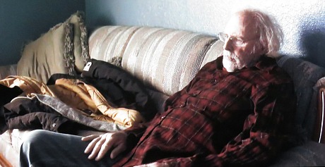
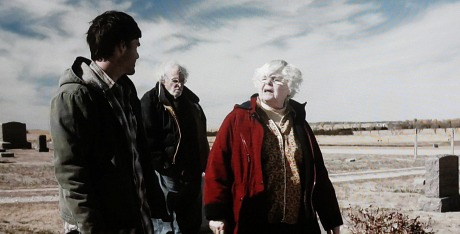
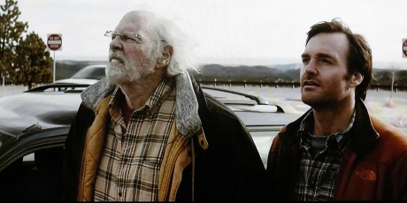
In an interview last year with Fade In‘s F.X. Feeney, Nebraska director Alexander Payne said that while a color palette is “not right for the film,” he “saw the color version once” and “liked it. It was really pretty. Some shots look even prettier in color. We made it look like a color from about 1970 or ’71, like the colors in Five Easy Pieces, for example.” Well, I just saw the color version on EPIX, and Payne, no offense and due respect, is completely full of shit. The colors in Five Easy Pieces were ripe and natural and plain — God’s own palette, nothing added or subtracted. The colors in Nebraska looked thoroughly pale and sickly and washed out. Everyone’s face had a kind of fake, fleshy makeup-base color, like people in black-and-white films do when the film has been artificially colored. The whole film looked that way. The palette was all creams and bieges and dead grays and K-Mart mustards and washed-out earthy browns and especially reds with an emphasis on maroons. Red this, red that…almost every jacket, sweater and flannel shirt worn was an eat-shit-and-die red. The commercial signs were red. One or two of the commercial buildings were red. The baseball cap that Dern was given to wear at the end had a red brim. The reason, I’m presuming, is that red looks good in black-and-white. Not a single vivid blue of any kind in the film except the sky. Green made three appearances (i.e., a living-room wall, faded grass, a pool table in a bar). Blacks were spotty and mostly fleeting. It was hellish to sit through in a sense. As if Payne and his dp, Phedon Papamichael, wanted the viewers in the countries that demanded a color version to suffer. The film looks 15 times better in black-and-white. Case closed.
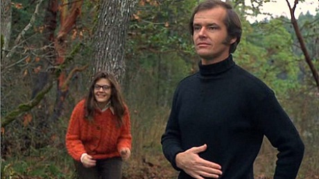
Third-act scene from Five Easy Pieces