A re-design is underway of Hollywood Elsewhere. The idea is to make it look and feel more 21st Century (the design mentality of the current site is 13 years old — it actually looks like it could have been designed in the late ’90s), and to load faster and be more ad-friendly and so on.
I’m down with this, but my concern all along has been to make sure the new site conveys a distinct “things haven’t changed that much” feeling — an assurance that HE’s identity and attitude is alive, intact and continuing within this new design. The new site should say “sure, this look significantly different in some ways, but it’s still very much the site that I’ve built, poured my heart into and self-branded over the last 12 and 1/2 years.”
A fresh, here-and-now design is essential but, as I’ve told the designers, Hollywood Elsewhere is nothing if not about my personal brand — my views, attitude, personality, passion, errors, shortcomings, gushings, travels, tenacity, aspect ratios, experience, arguments, prejudices…all of it. The new design needs to recognize this and embrace continuity.
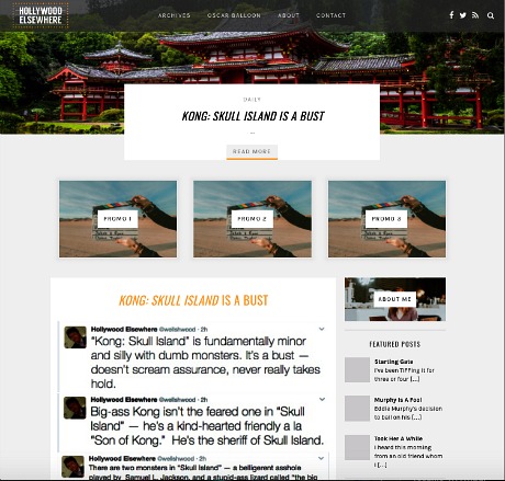
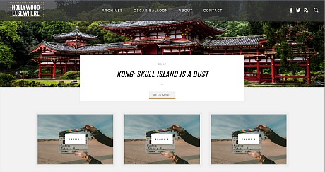
Please look at the test site as it now stands. Keep in mind that it’s a very early stab. I’m not hugely unhappy with the mobile version but the classic HE identity, I feel, has been all but erased. The initial idea was to take a generic uptown design, which looks like a Paris fashion magazine and which I thought was half-decent, and merge it with HE’s style and personality.
The small, almost-postage-stamp-sized HOLLYWOOD ELSEWHERE logo in the top left says it all. The designers of this test site seem to be interested in obscuring if not erasing the entire identity of Hollywood Elsewhere, which has been running since August ’04. (HE has actually been punching it for 18 and 1/2 years if you count my Mr. Showbiz, Reel.com and Movie Poop Shoot incarnations between October ’98 and July of ’04.)
It’s a mistake, for starters, to jettison the HE Hollywood sign logo, to not use my photo for identity purposes, to not use the same copy and headline fonts. Continuity is vital.
It seems to me that the designers are essentially saying, “Hollywood Elsewhere’s identity and personality aspects are being put aside in favor of a stylish but generic look that will load faster and look more 21st Century, but is entirely divorced from the soul and mindset of the site as it has existed since August ’04, and really since ’98. That was then, this is now, get over it.”
A friend’s viewpoint: “This is completely generic. It looks like hundreds of other sites. It looks okay — a smooth, professional appearance — but there’s no sense at all of the Jeffrey Wells brand.”
A fellow columnist’s opinion: “Not so bad. All you need to do is get your designer to do more with Hollywood Elsewhere logo at top. Your main posts should start right at the top, with your latest tweets as a sidebar on the right. Also add on the side some kind of ‘About Me’ thing with you and your picture and your attitude about the site. Definitely put your Oscar picks on the side, so we can find those. You should add art to the top of all your stories going forward for display purposes. The design is about easy access to your stories, and this will display them more fully for everyone to find, and your traffic will go way up. Jeff Wells is in the writing, in the posts.”
Another columnist’s view: “It’s a perfectly fine design — it’s just not distinctive, which your site definitely is. I think [name] is right in that ultimately it’s the writing. People will always tune in more for that than for anything else, but I would choose a bolder color combo for background, font, etc. Right now it all looks too light. HE is about dark blue and dark gray, and shouldn’t lose that. It should have a dark blue background for starters. The fonts should only be black, not yellow. Having only two columns opens up a sidebar but you could also have a left sidebar for a three-column site that might give you more ad space. On the other hand just having a sidebar is an improvement.”
Another friend’s opinion: “Where the hell is your photo? You need your picture on it. That’s an absolute! Otherwise it’s bad!”
Opinions are hereby solicited. Please, please disagree with me if you feel differently, but any thoughts at all would be appreciated.