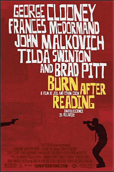
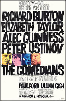
In a Film in Focus piece called “Genesis of a Poster,” Andrew Percival from Mojo House, an advertising company, discusses the poster for Burn After Reading. The inspiration, he says, was the stylish design of cutting-edge movie posters of the ’60s. The first example he mentions is the one-sheet for The Comedians. And yet he doesn’t mention the name of the godfather of edgy movie poster design in the ’50s and ’60s — i.e., Saul Bass. Why, I wonder? What’s Percival’s obstruction?
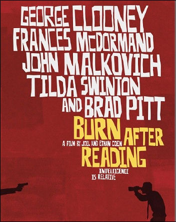
I wrote the following last June: “The influence of illustrator-designer Saul Bass persists and persists. Last year ThinkFilm’s Mark Urman ordered up a poster for Sidney Lumet‘s Before the Devil Knows You’re Dead that referenced the look of Bass’s classic one-sheets, and this year — now — we have a new poster that also hums with Bassian attitude, particularly in its use of a font similar to one Bass used in the ’50s and ’60s — hand-drawn, block letters — for the films of director Otto Preminger. Before revealing the new poster, here are three Bass samples:
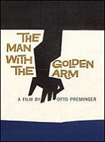
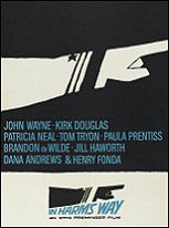
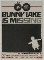
Saul Bass one-sheets for Otto Preminger’s The Man With the Golden Arm, In Harm’s Way and Bunny Lake Is Missing.
“And here’s the new poster, revealed today on Cinematical, for Joel and Ethan Coen‘s Burn After Reading. The font is actually a mixture of Bass and Pablo Ferro‘s hand-drawn title design for the opening of Dr. Strangelove.”