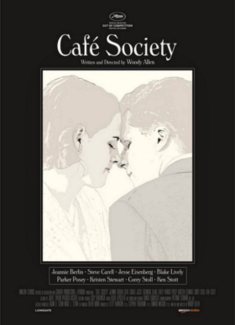
For the last 40 years posters for Woody Allen movies have mainly looked…well, fine but minimal. The idea, it always seemed, was to agree with or certainly not challenge the generally austere, less-is-more Allen aesthetic, which has most consistently manifested in the bare-bones, white-on-black style of his opening credit sequences. Simple, direct, tasteful…but never much in the way of flair or stylistic pizazz. This has all changed with the cool new poster for Allen’s Cafe Society (Amazon, 8.12.16). You have to assume this idea came from the advertising guys working for Amazon, the film’s distributor. I’m not saying previous Allen posters were dull or listless or lacking in merit, but none of them looked as sexy-cool as this newbie. Nothing, at least, is leaping out from my memory.