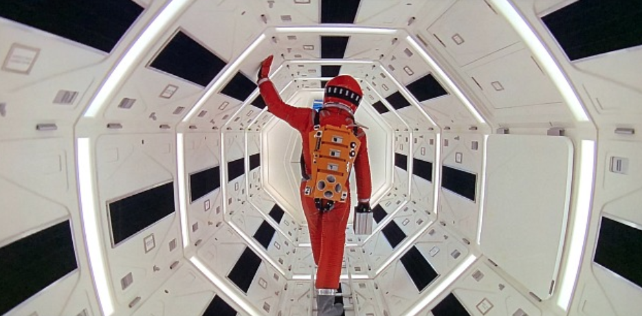
I can report directly that on the new 4K 2001 disc, the Discovery tunnel wall is indeed a kind of light rose-beige color. And yet the tunnel in the 2007 2001 Bluray, which I looked at this morning, is straight white. And I’m doubting the rose-beige thing. As I wrote a few days ago, “After watching 2001 in theatres at least 14 or 15 times over the last half-century, I’ve never once seen a print with a faint rosey-orange tint in the passageway scene. Not once, not ever.”
You have to wonder why Stanley Kubrick would have said to his set designer, “I don’t want the walls to be plain white or bone white…I want a William Haines feeling…I want a warmer, gentler, more feminine color.” I could see George Cukor or Vincent Minnelli requesting this, but not Kubrick.
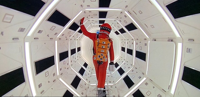
from 2007 Bluray.
from 2018 4K Bluray (second generation capture).
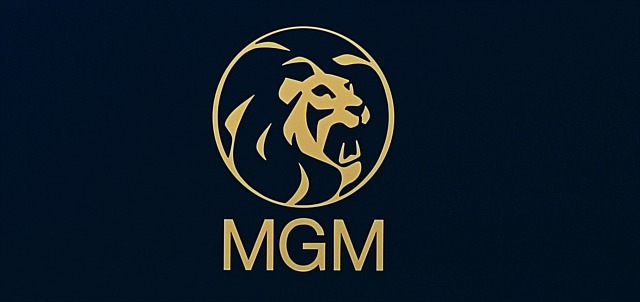
I can also report that the MGM logo on the 2007 Bluray is indeed bright blue with white lettering, and that the same image on the 4K disc is dark blue with amber lettering. I’ve seen them both with my own eyes, and only one is correct. I think it’s the former. I think the dark blue-with-yellow-lettering logo is bullshit.