
Herman Melville naturally couldn’t have known when he created Starbuck, the 30-year-old chief mate of the Pequod, a thoughtful and intellectual Quaker from Nantucket, that he was, after a fashion, helping to launch a hugely successful coffee empire that wouldn’t be copyrighted until 120 years after the publishing of “Moby-Dick“…imagine.
How’s that for a long, clause-dependent opening sentence?
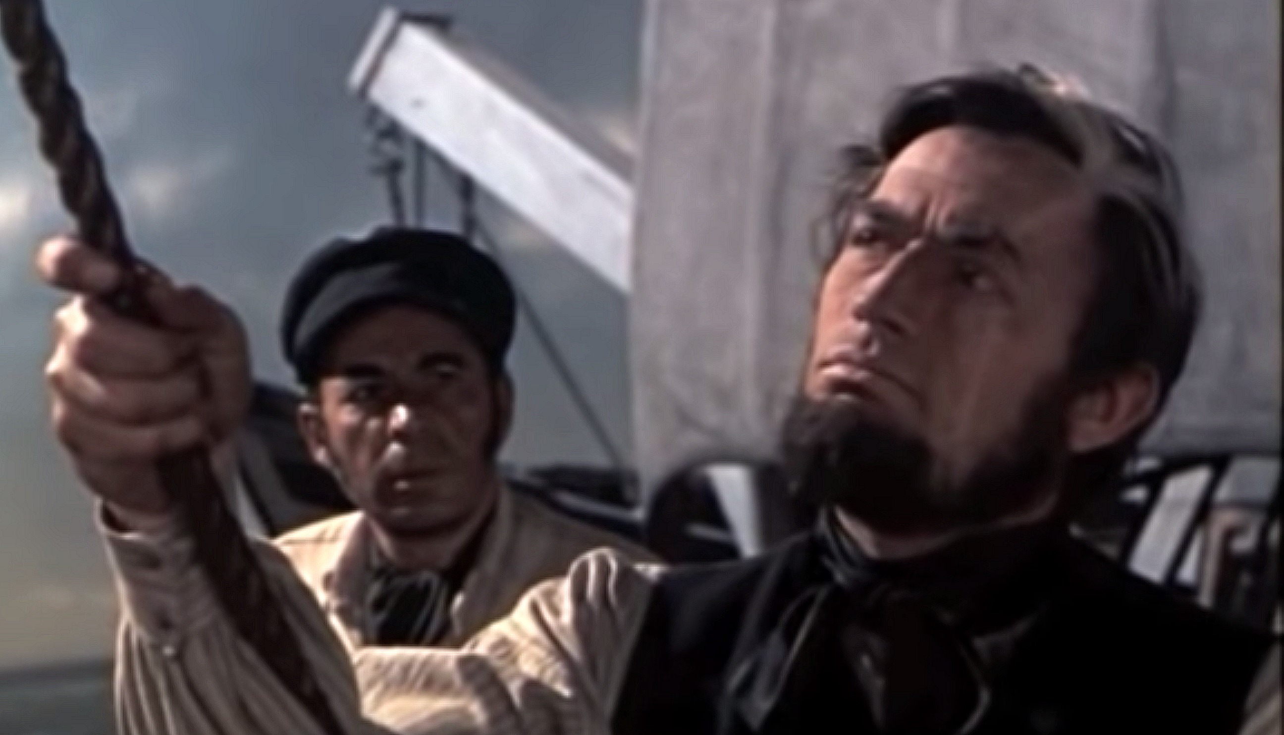
Seriously: I’ve been fascinated all my life by the faded, almost monochromatic color scheme used for John Huston‘s Moby Dick (’56) and co-created by dp Oswald Morris — subdued grayish sepia tones mixed with a steely black-and-white flavoring.
This special process wasn’t created in the negative but in the release prints, and only those who caught the original run of the film in first-run theatres saw the precise intended look.
There’s a new Region B Bluray of Huston’s film being issued by Studio Canal on 11.11, which will probably look like the 2016 Twilight Time Bluray, which features restoration work by Greg Kimble. The same featurette about the color process that was on the ’16 Bluray, “A Bleached Whale — Recreating the Unique Colour of Moby Dick,” will also be on the Studio Canal version.
https://hollywood-elsewhere.com/2016/12/not-real-mccoy-good-can-hoped/