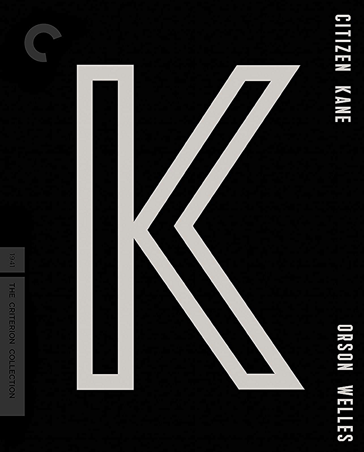
My honest view of the forthcoming K cover for their Citizen Kane 4K disc (11.23.21) is that it’s kinda dull. It certainly isn’t what any honest designer would call “oh, wow.”
Serious question: Which other films could be represented by a single letter on a Bluray cover? Besides Costa Gavras‘ Z, I mean. If Criterion wanted to go minimalist with a North by Northwest 4K disc, they could use a NXNW…right? They could go with a big M for a Manchurian Candidate jacket cover, I suppose. Or a big R for a Raider of the Lost Ark cover.
But you know what? Fuck this idea. You could decide to single-letter anything. It’s a lame concept.
The first minimalist one-letter logo was the trapezoid N for NBC, which was used between ’76 and ’79.