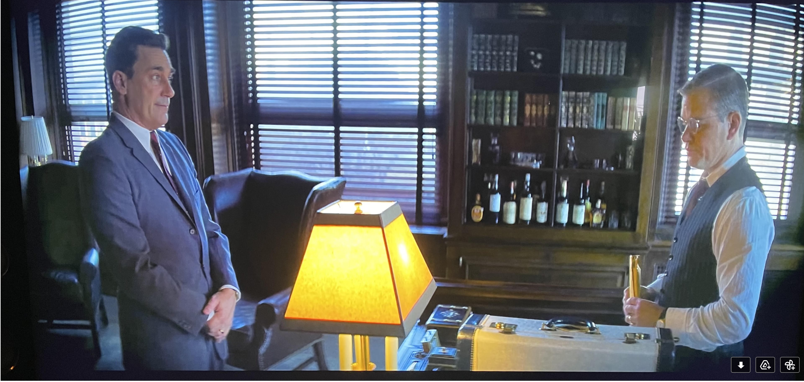
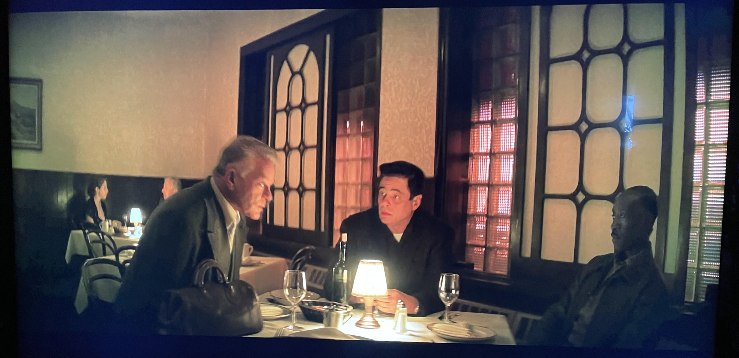
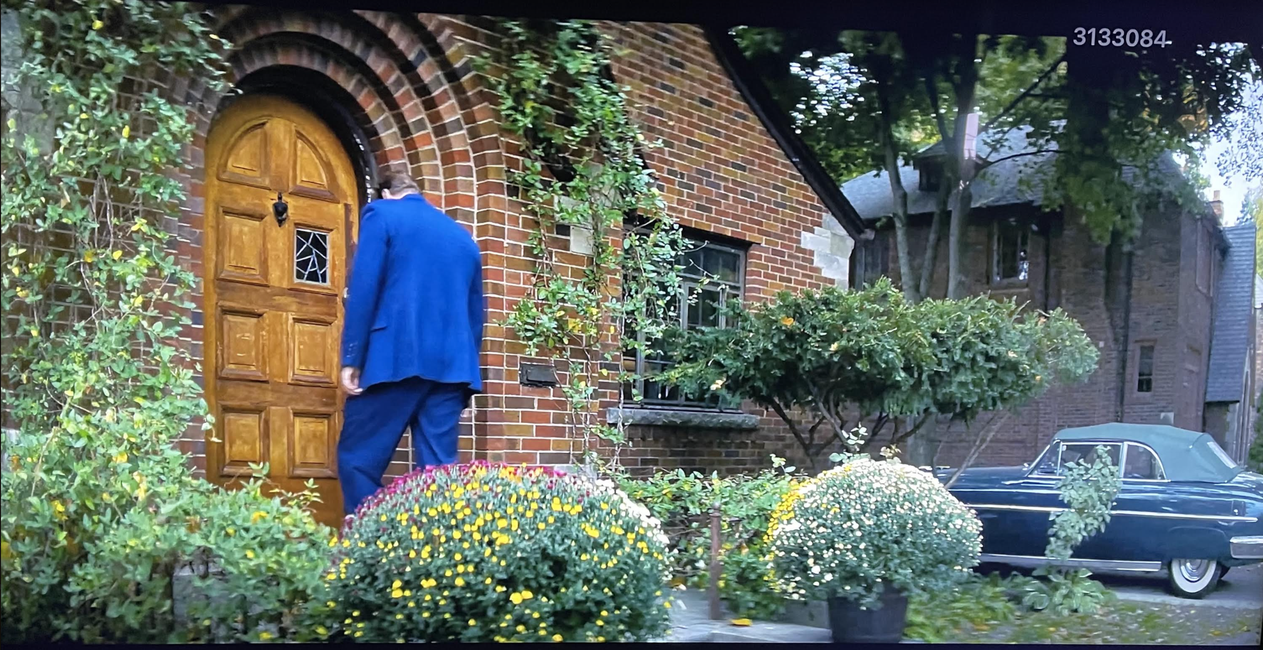
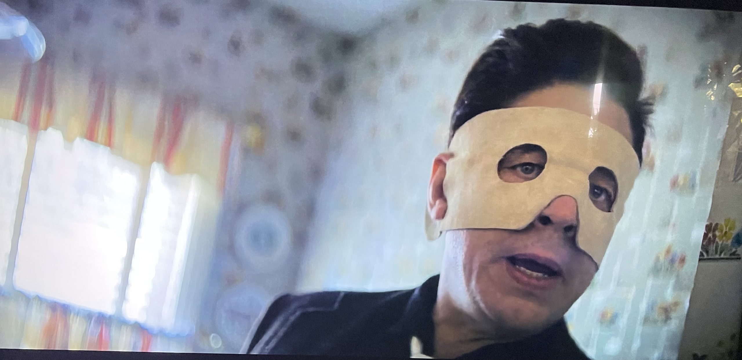
In keeping with longstanding tradition, Steven Soderbergh not only directed No Sudden Move but shot it (as Peter Andrews) and edited it (as Mary Ann Bernard). I was particularly struck by the visual signature this time as Soderbergh apparently used some kind of spherical wide-angled lens that occasionally delivers what looks like a 2.2:1 aspect ratio, and which compresses images on the sides.
In other words, Soderbergh doesn’t seem to be delivering a standard 2.39:1 (or 2.4:1) Scope aspect ratio but something closer to the slightly distorted cinematography seen in portions of Around The World in 80 Days — i.e., portions that used a spherical bug-eye lens.
The No Sudden Move visuals also struck me as similar to the distinctive framings that were seen in Alfonso Gomez-Rejon‘s The Current War, which was shot by Chung Chung-hoon. Lots of headroom and elbow room. Objects squeezed on the sides.
And yet very few critics have even mentioned this curious (or certainly noteworthy) visual approach.


Fragment of Current War review, originally posted on 9.2.17: “In an attempt to reflect the unusual, headstrong mentalities of Edison and Westinghouse, [director Thomas] Gomez-Rejon and Chung have gone with a kind of early ’60s Cinerama approach to visual composition — widescreen images, wide-angle lenses and a frequent decision to avoid conventional close-ups and medium shots in favor of what has to be called striking if not bizarre avant-garde framings in which the actors are presented as smallish figures against dynamically broad images and vast painterly landscapes.”

