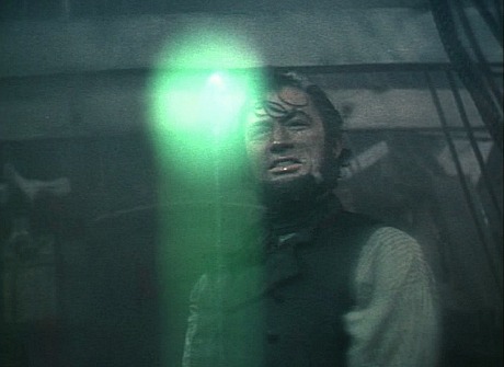
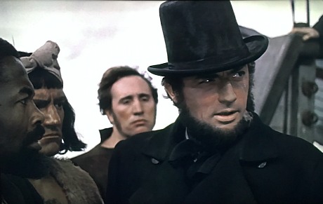
Yesterday I received and watched Twilight Time‘s Bluray of John Huston‘s Moby Dick (’56). It delivers an excellent simulation of the appearance of the original release prints — not desaturated but the result of three-strip color prints blended with a black-and-white negative. To my eyes the 1080p image delivers the most striking, well-finessed attempt to imitate what the film looked like to first-run audiences a half-century ago.
The Bluray doesn’t provide an actual recreation of the color process created by Huston and dp Oswald Morris, but it makes Moby Dick look as good as it’s ever going to look in this regard. Call it largely satisfying, and that ain’t hay.
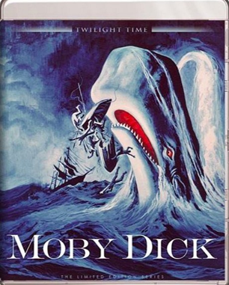
Moby Dick‘s color process was restored by Greg Kimble over an eight-month period. The Bluray contains a nice supplemental essay, A Bleached Whale: Recreating the Unique Color of Moby Dick.
Here’s a portion of a 12.3.15 piece that I ran about Kino DVD version:
“It’s a good time to reconsider the fascinating color scheme — subdued grayish sepia tones mixed with a steely black-and-white flavoring — created by Huston and Morris. This special process wasn’t created in the negative but in the release prints, and only those who caught the original run of the film in theatres saw the precise intended look.
“There have been attempts to simulate this appearance, but the Real McCoy visuals were a different, more distinct animal. I saw about three or four minutes worth of an original Moby Dick release print at the Academy’s Samuel Goldwyn theatre sometime in the early to mid ’90s, and I’m telling you there was something spooky about them. I was riveted by how striking and other-worldly the color looked — something that wasn’t really ‘color’ as much a mood painting that came from someone’s (or some lab’s) drizzly damp November soul.
“I’d love to visually convey to HE readers what the 1956 release prints of Moby Dick really looked like — that wonderful silvery overlay, distinctive but muted and mixed with grayish color. But with luscious black levels.
A restoration specialist writes as follows: “John Huston’s Moby Dick was never desaturated. It was created using early 1940s three-strip Technicolor technology, based upon a 5248 Eastman negative, which is now faded.
“The 2015 DVD released by Kino is based upon a re-comp of the sep masters, in an attempt to give an idea of what the original may have looked like. The original was created by taking the original Eastman negative and printing in dye transfer Technicolor over a black & white positive image taken from the green record, probably at somewhere around 25-30% density.
“This gave the illusion of lowering the color saturation, along with contrast.
“The original look of Moby Dick “can be reproduced today in the digital realm, but I don’t see MGM having any interest in doing so. For those who seek an inkling of what the original looked like, the current Kino DVD sends them in the correct direction. Unfortunately, it’s based upon bargain basement MGM work, with zero restoration.
“That said, the Kino release is as good as it can possibly be under the circumstances, and I’m pleased that it was released. It simply cannot be used for anything requiring actual study or research. You will currently find no video incarnation of the film that replicates the original with any precision.”