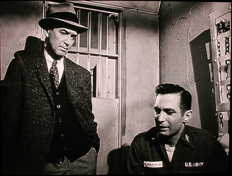
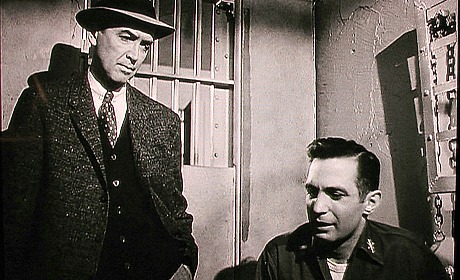
Yes, another 1.85 vs. 1.33 aspect ratio piece on Criterion’s Anatomy of a Murder Bluray. But no, not another “1.85 fascism” rant. I’m…well, I guess I am talking about fascism. Otto Preminger‘s 1959 film looks sublime at 1.33. Needle sharp and comfortable with acres and acres of head space. Plus it’s the version that was shown on TV for decades. It looks stodgy and kind of grandfatherly, and that’s fine because it’s your grandfather’s movie in a sense. Boxy is beautiful.


It is perverse to deliver the Bluray — obviously the best that Anatomy of a Murder has ever looked on home screens — with one third of the originally captured image chopped off. Flip the situation over and put yourself in the shoes of a Criterion bigwig and ask yourself, “Where is the harm in going with the airier, boxier version?” Answer: “No harm at all.” Unless you’re persuaded by the 1.85 fascist view that a 1.33 aspect ratio reduces the appeal of a Bluray because the 16 x 9 plasma/LED/LCD screen won’t be fully occupied.
The above comparison shows that cropping the image down to 1.85 from 1.33 doesn’t kill the visual intention. In the 1.85 version James Stewart simply has less breathing room above and below his head. But the comparison below makes my case. A scene in a small jail cell. The boxier version is clearly the preferred way to go. It feels natural and plain. The 1.85 version delivers a feeling of confinement, obviously, but Otto Preminger wasn’t an impressionist. He was a very matter-of-fact, point-focus-and-shoot type of guy.


