
I’ve just clarified and expanded upon my problems with the color orange, which I began discussing late yesterday afternoon. I brought it up initially because orange rules like a dictator in a series of movie posters created Olly Moss for the Alamo Draft House’s Rolling Road Show. Striking, yes, but a little off-putting. Well, slightly.

In response to my contrarian comments HE reader bmcintire pointed out that “this Roadshow is being called the ‘We Are All Workers Rolling Roadshow,’ orange being shorthand for ‘construction’ or ‘working class‘. You even put the word ‘Work’ in your headline. Take a look at the cluster of posters on The Daily What and tell me the first thing you think of isn’t ‘Construction Zone.'”
Precisely.
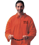
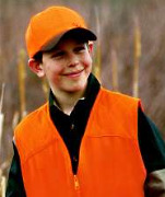
Orange is a basic stand-out color used for plastic construction hats, street traffic cones, hunter jackets, prison jump suits, etc. Obviously. But this in itself makes it seem like a symbol for regimentation and social pigenholing. It’s a working-class color, yes, but with socially segregationist connotations. A kind of negative branding, if you will.
If you’re a certain kind of prole (or, not to link the two, a criminal), you’re going to have to make a place in your life for the most obnoxious color in the spectrum. No ifs, ands or buts — you’re just going to have to deal with it. But if you’re an X-factor or an upscale professional-class type or a naturalist, orange can be avoided or at least be segregated as an accent color (which is okay from time to time). The point is that professional class or X-factor types have a choice to keep orange in its place (and they all get this, of course), and many proles for the most part don’t.
Orange symbology in this sense is so burned into general public consciousness that it almost diminishes the natural attractiveness of orange in nature — the fruit, the occasional flower, the oriole, sunsets. Notice that nature is tasteful enough to use orange very sparingly. Nature knows what Frank Sinatra and Olly Moss didn’t recognize — that orange used with any kind of force or emphasis feels a bit oppressive. It’s a safety color when you’re hunting or working construction or standing on a busy traffic road in the evening, but it’s also a kind of control color — a symbol used to enforce rules and segregate prisoners and make people stay within boundaries. Orange doesn’t say “life can occasionally be beautiful or transporting.” It says “do this,” “watch out,” “don’t go there,” “slow down,” etc.
The notion that orange is a kind of aesthetic repellent if delivered in heavy doses is not exotic rocket science. I think everyone understands this deep down. Like aromas, colors matter much more than people seem to realize. They permeate and create moods, etc.
I know if I see a football team with orange jerseys, something in me will start rooting for them to lose. Neurotic as this sounds, I never liked the sound of Paul Verhoeven‘s Soldier of Orange because of this phobia. During the ’70s orange always seemed a bit odious by its association with Irish Protestants (I’ve always sided with the Catholics in that conflict). I always winced a bit when I visited Jett in Syracuse from ’06 to ’10 with orange being that university’s color — banners, jerseys, T-shirts, signs. (It used to be blue and orange, but then they dropped the blue.) I think I found a way to relax early on with Stanley Kubrick‘s A Clockwork Orange because it was clear from the get-go that it was just a name or sound that Anthony Burgess had selected at random and had nothing to do with a color scheme.