
If you knew what you were looking at, last night’s TCM Classic Film Festival Screening of Alfred Hitchcock‘s Vertigo was a disaster. The great Kim Novak took a bow before it began and the crowd gave her a standing ovation, and then the film began and it looked like dogshit. The image quality wasn’t just poor — it was hideous. Artificially brightened, washed-out color, incorrect tones. To me it resembled what a black-and-white film looks like when it’s been colorized. It was without question the ugliest rendering of this classic 1958 film I’ve ever seen in my life.
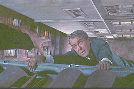
A fairly accurate simulation of how the rooftop rain gutter scene looked during last night’s screening, and in fact how much of the film looked throughout.
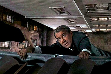
A simulation of how the same shot is supposed to look, more or less.
The film was digitally projected with a recently created DCP. Before the screening began I called the office of Bob O’Neil, Universal’s vp of preservation and vault services, to ask what the source of the DCP was. O’Neil was at the TCM screening, but the source wasn’t the 1996 Vertigo restoration by Robert Harris and James Katz, I was told, but a new digital scan of some kind.
“Really?” I replied. “But the Harris-Katz restoration was such a beautiful job. Why wouldn’t they use that?” It was suggested that I email O’Neil and ask. I did, twice, and he didn’t reply.
I knew within seconds that I was looking at a degraded rendering. Nobody in the audience said anything or got up to complain, of course. They just sat there like polite sheep, but I was beside myself. How could Universal have supplied this atrocity to the respected TCM Classic Film Festival, which people pay good money to attend? I stuck it out for roughly 40 minutes before leaving in disgust.
The above renderings of the “hanging from the rain gutter” scene at the very beginning are a pretty good simulation of (a) what I saw last night at the Chinese vs. (b) what the same shot looks like under prime conditions. The scene is supposed to be occuring at dusk or in the early evening, but the brightness levels had been digitally pushed.
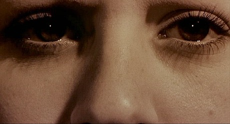
The way the main-title image is supposed to look, as included on the Harris-Katz restoration.
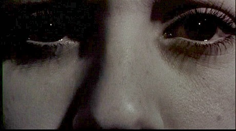
The way it’s not supposed to look, which is what everyone saw last night.
The opening credits begin with a closeup of a woman’s face. The correct presentation on the Harris-Katz restoration shows the woman in black-and-white, and then the color wheel starts to appear from inside the retina of her eye. In last night’s version her face was covered in an orange sepia — wrong.
James Stewart‘s infamous brown suit is supposed to be a regular earthy brown, and not violet brown or mauve brown or grayish brown, which is how it looked last night.
The opening rooftop chase scene contained the double-shot echo effect that was put onto the soundtrack of the 1996 Vertigo restoration, so maybe the whole film had those extra foley effects. I’m not sure as I didn’t stick around.
The bottom line is that while several scenes looked acceptable from a generic, not-overly-demanding perspective, the general richness of the Vertigo color scheme had a creepy, quasi-bleachy feeling — a look of artificial desaturation. And it made absolutely no sense to present one of Universal’s crown jewels to a well-heeled audience that had every reason to expect the very best.
Kim Novak doesn’t suffer fools. Remember how she lambasted The Artist and the Weinstein Co. when she realized that several minutes of Bernard Herrmann‘s Vertigo score had been used verbatim for The Artist‘s soundtrack? I don’t know if Novak stayed for last night’s screening, but if she did and if I were her I would be on the phone to Universal honcho Ron Meyer or vp technical services Peter Schade this morning and saying, “What the hell are you guys doing? You could have made Vertigo look wonderful if you’d used the restored version created by Harris-Katz as the source of the DCP, and you decided not to?”