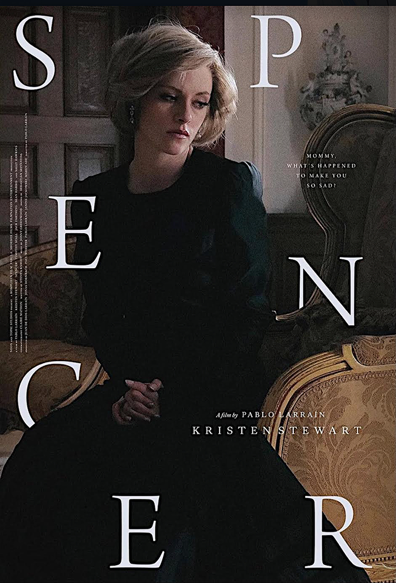
Hats off to whomever designed this poster. Cool and classy, excellent poise and balance, a suggestion of tragedy. Kristen Stewart doesn’t wear a black outfit of any kind in the film, but that’s okay. The poster is the poster and the film is the film, and Spencer doesn’t live up to what the poster conveys or promises.
What are some other instances in which a poster was much more exciting and engaging than the film it was selling?

