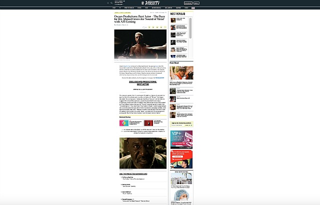
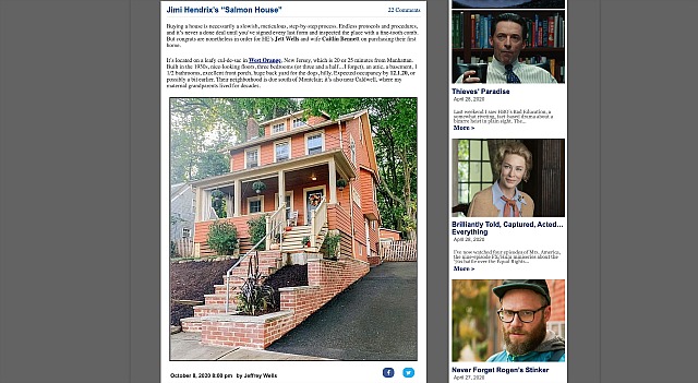
For years the vast majority have been visiting websites on their smart phones and iPad/Kindles, and the coding naturally caters to that reality. But when you go to the main N.Y. Times page on your Macbook Pro, the copy is centered and occupying roughly 60% of the acreage. Visit Hollywood-elsewhere.com on your laptop, and the top logo-and-banner area occupies 70% of the screen while the centered column-space width represents about 1/3 of the screen space, and is easily expandable. But when you go variety.com everything is weirdly scrunched into the middle; The Hollywood Reporter occupies a wider area or close to half the screen. I only know that laptop-wise, HE’s column copy is bigger and wider and less of a hassle than the trades.


