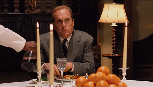
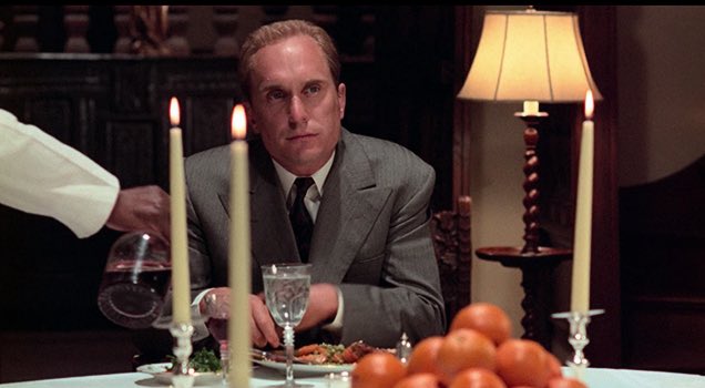
Tom Hagen at Jack Woltz‘s dinner table — the 2008 Robert Harris-Gordon Willis version on top, the 2022 4K “restoration” version below. There’s nothing particularly “wrong” with preferring the 2022 version — the oranges, candles, pale amber lampshade and carved wood panelling have good color, but Hagen’s skin tone is a little pinkish…sunburn, sweat. In the 2008 version his skin has a warmer shade. More importantly, it blends in with the general color scheme of the frame. This is why I stand with the 2008 version, which Mr. Willis helped to create anyway so where’s the argument?


