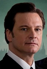
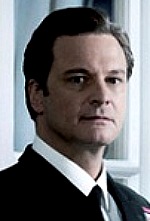
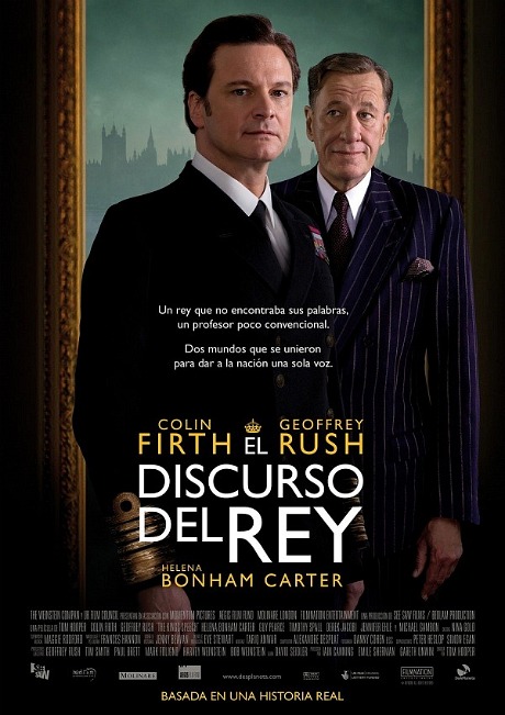
Earlier today Awards Daily‘s Ryan Adams posted two new King’s Speech posters — an English-language version (possibly the new Weinstein-approved one-sheet) and a Spanish-language poster. Both are superior to that really crappy one that a few columnists ripped to shreds earlier this month. The Spanish poster, I feel, is easily the most attractive of the three. But it has, of course, a glaring sideburn problem.


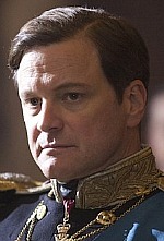
I presume I don’t have to remind anyone that hairstyles among the male British royals have always been ultra-conservative, and certainly didn’t allow for sideburns in the late 1930s. The right-side photo of Colin Firth-as-King George VI (above) is the correct look with only a bit of hair alongside the ears, or just this side of military. But in the Spanish poster (far left), Firth is wearing early 1970s-level sideburns — i.e., close to the kind that White House press secretary Ron Zeigler used to have and even a little bit like Elvis Presley‘s in Jailhouse Rock. Obviously someone in the Weinstein Co. art department noticed this error and raised Firth’s sideburns by a half-inch or less for the English-language version (middle). But they didn’t quite get it right, keeping the sideburns thick and squared off, which still argued with Firth’s appearance in the film.
If you want a wild guess I’d say that Firth (and also possibly Rush) posed for the new posters fairly recently. Firth’s hair looked like it does in the Spanish poster, sideburns and all, when I spoke with him earlier this month. How else to explain the 1970s styling on the head of a late 1930s British king? Firth posed, everyone was in a hurry, nobody thought about the sidies and then someone finally said “hey, wait a minute!” when the English-language poster was in the final-approval stages.

