
We’re all aware that Ron Howard‘s In The Heart of The Sea (Warner Bros., 12.11) is about the actual sea voyage that inspired the writing of Herman Melville‘s “Moby Dick“. With Howard’s long-delayed film about to open, it’s a good time to reconsider John Huston’s Moby Dick (’56) and more particularly the fascinating color scheme — subdued grayish sepia tones mixed with a steely black-and-white flavoring — used by director John Huston and dp Oswald Morris. This special process wasn’t created in the negative but in the release prints, and only those who caught the original run of the film in theatres saw the precise intended look.
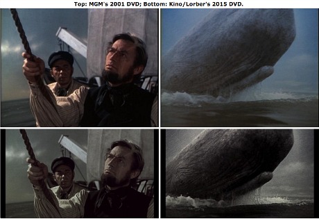
Comparison images stolen from DVD Talk URL containing Thomas Spurlin’s review of Kino Lorber’s Moby Dick review.
There have been attempts to simulate this appearance, most recently in a Kino Lorber DVD that popped in mid-September, but the Real McCoy visuals were a different, more distinct animal. There was almost something spooky about them. I saw about three or four minutes worth of an original Moby Dick release print at the Academy’s Samuel Goldwyn theatre sometime in the early to mid ’90s, and I was riveted by how striking and other-worldly the color looked — something that wasn’t really “color” as much a mood painting that came from someone’s (or some lab’s) drizzly damp November soul.
No disrespect to the MGM guys who created the HD master that the Kino Lorber DVD is taken from (and which will also be the basis of a forthcoming Twilight Time Bluray of Moby Dick, expected to pop sometime next year) but I’d love to visually convey to HE readers what the 1956 release prints of Moby Dick really looked like — that wonderful silvery overlay, distinctive but muted and mixed with grayish color. But with luscious black levels.
Actual images scanned from the 1956 release prints haven’t been seen by anyone for many decades, and I’d like to set the visual record straight by capturing five or ten images from an original 1956 release print. I began inquiries today about trying to accomplish just that. There’s a lot of rigamarole and red tape and whatnot, but it’s possible it could happen.
An authentic Moby Dick Bluray would be a perfect Criterion project — creating a high-def version of an original mint-condition release print with the actual, real-deal color scheme. But they can’t jump into it because the notoriously indifferent honchos at MGM have no interest in showing any kind of Scorsese-like devotion to Film Catholicism, and are therefore unaccomodating when it comes to sub-licensing agreements with outfits like Criterion, and because a serious and proper restoration of the real Moby Dick would cost, I’m told, “well into six figures.”
A restoration specialist writes as follows: “John Huston’s Moby Dick was never desaturated. It was created using early 1940s three-strip Technicolor technology, based upon a 5248 Eastman negative, which is now faded.
“The DVD released by Kino is based upon a re-comp of the sep masters, in an attempt to give an idea of what the original may have looked like. The original was created by taking the original Eastman negative and printing in dye transfer Technicolor over a black & white positive image taken from the green record, probably at somewhere around 25-30% density.
“This gave the illusion of lowering the color saturation, along with contrast.
The original look of Moby Dick “can be reproduced today in the digital realm, but I don’t see MGM having any interest in doing so. For those who seek an inkling of what the original looked like, the current Kino DVD sends them in the correct direction. Unfortunately, it’s based upon bargain basement MGM work, with zero restoration.
“That said, the Kino release is as good as it can possibly be under the circumstances, and I’m pleased that it was released. It simply cannot be used for anything requiring actual study or research. You will currently find no video incarnation of the film that replicates the original with any precision.”
From 9.15.15 DVD Talk review of Kino Lorder Moby Dick, written by Thomas Spurlin:
“Shot by Huston’s recurring cinematographer Oswald Morris, who also filmed Moulin Rouge and Heaven Knows, Mr. Allison for the director, Moby Dick employs an intentional sepia-toned…look due to an innovative dye technique. It gives the entirety of the film a vintage tint that emphasizes a novel-like texture about its aesthetic, all while giving the Pequod’s voyage an ethereal feel — almost mythic.
“Given my lack of experience with a theatrical presentation, it’s difficult to attest to the accuracy of this coloring; however, it’s worth noting that the visualization here does bring the sepia-hued appearance far closer to the desired ‘old, worn pictures in a book’ aesthetic. In fact, this transfer might overcompensate for that at times, leaving the colors — especially blues — awfully muted, reaching near grayscale levels late in the film.”
From a movie buff chat room: “I certainly agree that this would be an ideal project for Criterion to tackle — but mainly, I just wish to hell SOMEBODY would take on the task of restoring this very special movie which so desperately needs it. I’m told that the original elements needed to restore that special color process invented for the film may no longer exist, a film preservation tragedy if ever there was one.
“This particular film, no matter what the artistic quality, is the perfect example of why it’s often best to stay within the parameters of the techniques that are in the standard filmmaking canon. If you want your artistic creation to last and be seen properly, you must employ the techniques which will be around generations later.
“If Bob DiMucci‘s description of the technique is accurate — that the Eastman Color negative was printed in tandem with a black-and-white negative drawn from it, as has often been reported — then the primary problem today is likely the amount of fading that the original color negative has experienced over the last 50-plus years — and if it is even printable anymore.
“If, however — and this is a big ‘if’ — Technicolor used their imbibition printing process to print the film, then that would mean that they had to make black-and-white separations off the original color negative (which don’t fade) as well as the black-and-white Panchromatic “registered” negative.
“If that’s REALLY the way it was done, then it might be possible to reconstruct — first — the proper color, and — then — the added black-and-white overlay through high-resolution digital scanning and restoration, and bring the film back to its original quality.
“Unfortunately, there is another joker in the pack, and that is the ownership status of the film. It is a ‘Moulin Production,’ Moulin being the Mirisch Brothers, and the film was originally distributed through Warner Bros. After 7 years of distribution by Warners, the film reverted back to the Mirisches who eventually sold it to United Artists to recoup some of their lost investment. In recent years it has been controlled, at least on video, by MGM Entertainment — the heirs of United Artists — though there may still be some theatrical exhibition rights claim by Warner Bros.
“Thus, with the final rights somewhat clouded and shared, perhaps, by MGM and WB, and the very shaky financial structure of the contemporary MGM Entertainment, you can probably make a pretty safe bet that MGM Entertainment is not about to cough up money — at least the huge kind of money needed—to restore this film. They are in bankruptcy and are struggling to keep their act together as it is.
“I’m slowly coming to realize that it’s a fact of life there will be some films I’ll NEVER see in their original form again, sadly.”