I’ve arranged to see WHE’s forthcoming 2001: A Space Odyssey 4K UHD Bluray (streeting on 11.20) at a friend’s place (possibly as soon as this weekend), but some screen captures & comparisons posted by DVD Beaver‘s Gary W. Tooze are alarming. Because what I’m seeing are images that are significantly darker than the 2001 images I’ve been looking at for decades on theatre screens, VHS, laser discs, DVDs and the 2007 WHE Bluray. And the sides of the earlier Bluray (2007 and 2011) have been sliced off, for some reason, on the 4K.
I need to wait until I see the 4K myself, but the Tooze images are not pleasing, and the last time I checked he wasn’t blatantly misrepresenting Bluray images as a rule. So I’m wondering how or why Stanley Kubrick‘s 1968 classic is looking so damn murky and muddy.
All I know is that I’m alarmed all over again. Remember that despite what we’ve all read about this not being the non-restored Nolan “nostalgia” version with the piss-yellow and teal tints (and it’s really not, I’m told), this WHE 4K Bluray has had three fathers — Ned Price, Chris Nolan and Leon Vitali. And at least one of them is the bad guy here because 2001 has never been this dark, and it never should be. I mean, some of the 4K screen captures are ridiculous.
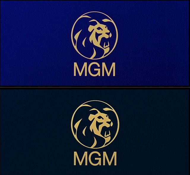
1. Tooze comparison #1 — the MGM logo. All my life the color of 2001‘s MGM logo has been a slightly muted publisher’s blue, like the top image from the 2007 Bluray. Now it’s a mixture of gravel gray and midnight blue — like the color of flagstone mixed with a dusky, early-evening sky. In short, it’s a lot darker and completely different than the logo image I’ve been looking at for half a century now. What is this?
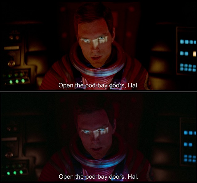
2. Tooze comparison #2 — “Open the pod bay doors, Hal”. In the above 2007 Bluray image, Dave looks like he always has inside the pod while asking HAL “what the hell’s the problem,” etc. In the bottom 4K image, he looks like a demon ghost from The House on Haunted Hill. All you can really see are his piercing, key-lighted eyes. What the hell is this?
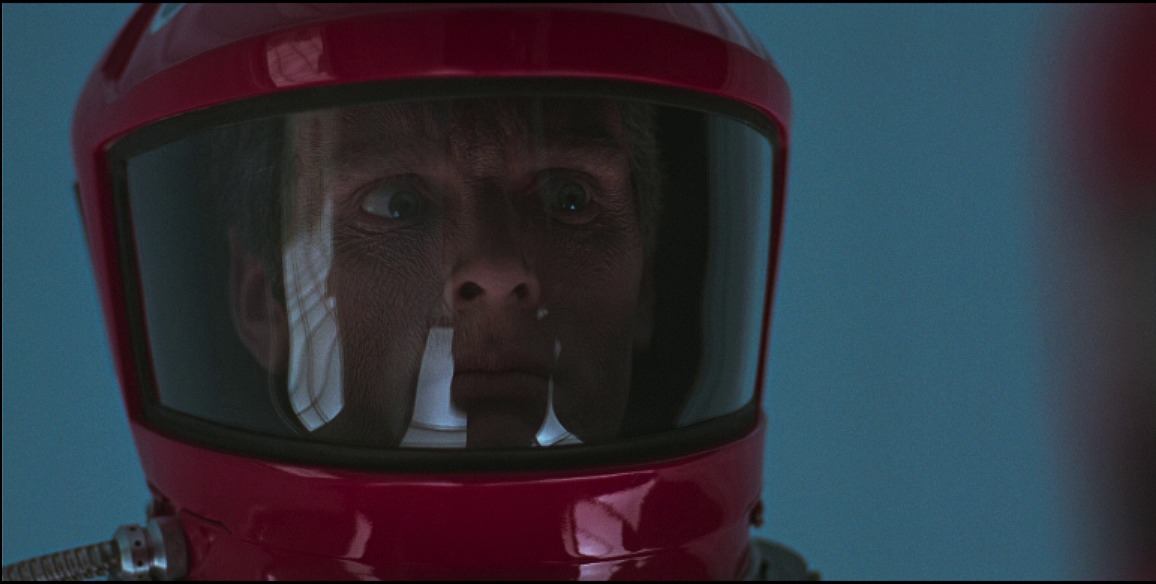
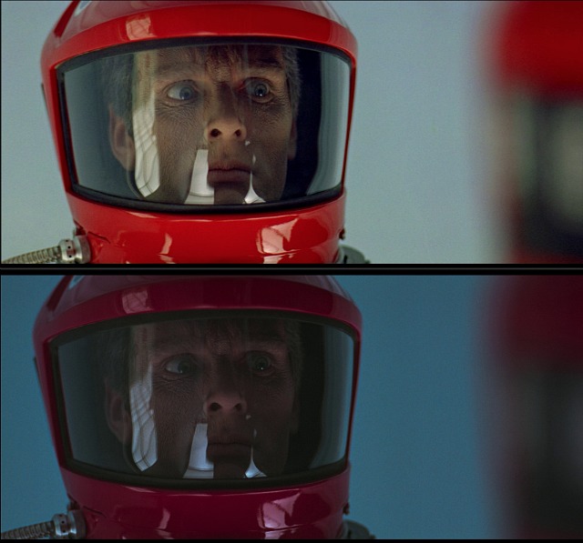
3. Tooze comparison #3 — Space-suit Dave in French chateau. The 2007 Bluray image of red-helmeted Dave is perfect, but you can barely make out his facial features in the 4K image. This isn’t just overly dark — it’s absurdly dark, as in the person who mastered this shot was (a) drunk, (b) stoned or (c) an anarchist who snuck into the WHE video mastering room with the intention of fucking things up.
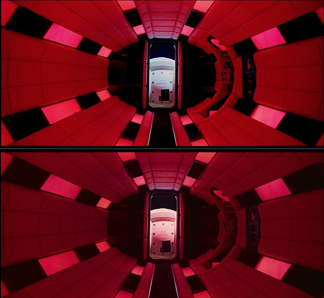
4. Tooze comparison #4 — Discovery air-lock chamber. If you compare closely you’ll see that visual information on the right and left sides of the 2007 Bluray image (which was taken from a 35mm source) has been sliced off for the 4K.