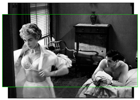
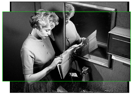
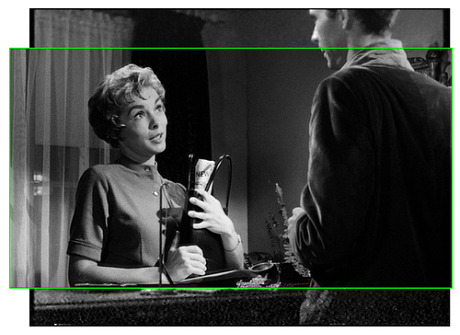
I was hoping against hope that the Universal Home Video’s forthcoming Psycho Bluray (due on 10.19) might have an optional version with the original 1.37 to 1 framing, which would obviously offer more top-bottom information than today’s 16 x 9 plasma/LCD flatscreen image can afford. But no such luck.
Some people don’t like to hear this, but Alfred Hitchcock protected this 1960 classic so it could be shown in theatres and on TV with a 1.37 to 1 aspect ratio. On top of which many theatres back then were using 1.66 to 1 aperture plates so don’t tell me. The Psycho norm was never intended to be 1.78 to 1 (i.e., the widescreen aspect ratio for high-def video). For the most part Hitchcock expected his film to be shown within ratios of 1.66 to 1 (moderate rectangle) or 1.37 to 1 (next door to a perfect box).
What happened is that the high-def crowd came along about ten years ago and said, “Okay, we’re wiping the slate clean and starting off totally fresh, and as far as we’re concerned all non-CinemaScope films shot from the mid ‘to late ’50s to the present will henceforth be seen in a 1.78 to 1 aspect ratio. Take it or leave it. We realize we’ll be chopping off information that was intended to be seen, but screw it…we don’t care.”
Here are two postings from www.hitchcockwiki.com about this subject, the first from British Hitchcock fan James Whitehead:
“I dug out my ten-year-old VHS tape of a broadcast print of Psycho and ran it on a 4:3 telly alongside the Region-2 DVD, playing on the eMac. Although a little was lost from the sides of the television print, it was certainly not scanned & panned. In contrast, a great deal of the picture was cropped from the top and bottom on the ‘widescreen’ DVD. I can’t take screen-shots of the television alas!
“The composition seemed to me to be more satisfying in the television print. Low ceilings and doorways help to give the picture a greater depth of field. Exteriors also benefitted and appeared to have been framed with the squarer ratio in mind. Take the mountain-range where Marion takes a fateful fork in the road: this shot is handsomely-composed in the television print with the rolling mountains fully in the frame with sky above. On the DVD, the tops of the mountains are brutally lopped off and the composition seems flatter.
“Shots of Marion driving are so commonly reproduced as to be nearly as iconic as the shower scene. Yet some details are entirely invisible on the DVD. For instance the curved speedometer is illuminated beneath the windscreen-wiper — only the moulding is visible as a dark region on the DVD. You might also never realize that the steering wheel has an inner concentric chromium horn.
“The Bates Motel has an illuminated office sign over the door. It is in full view in many more shots in the 4:3 print. Its glow is detectable in some shots on the DVD but the sign itself has been cropped. I am sure Hitchcock wanted it to be seen: it may remind the viewer of the site of Marion’s crime and the way it continues to glow suggests that Norman’s work is continuing.
“The low ceilings and the oppressive stuffed birds of the study are again iconic yet one of the best shots is of a large owl whose outspread wings cast a giant shadow on the ceiling. You will see the owl and miss the shadow completely on the DVD. It dominates the scene as it should on the television print.
“The compositional use of circles in the shower scene is often commented on. Yet the famous reverse zoom shot as the camera screws and retreats from Marion’s face is much less effective when most of the twist has been completed before her lower face is in view. Slightly later, the rounded lines of the basin Norman washes in are cropped on the DVD.
“The hooks on the shower curtain are entirely cropped from one shot – making a very dull frame entirely made up of shower-curtain on the DVD. The hooks are surely the point of the shot as they are later to be ripped off.
“I watched only the first half of the film but time after time, the composition seems more satisfying in the television ratio. It is well-known that Hitch used his TV crew to make the film on a tight budget. It was certainly conceived as a cinema-event — offering the viewers shocking things they could not see on television. So it’s ironic that telly should turn out to be showing us things the DVD misses out! Now, again, the question is just how much of the picture was seen in the cinema?”
A Swedish fan named Matewan offered the following thoughts:
“Psycho was photographed in open matte. That is the same as 1.37:1. But the viewing ratio is 1.78:1. And that is exactly the format of the DVD releases. The 35 mm prints was released with the open matte format and was cropped on screen in the cinemas.
“But there is one scene where the frame is cropped in all prints. The shower scene. The censorship of the early ’60s would never have agreed to release a movie where you could risk seeing certain parts of the female anatomy. But, as I recall, it was only the lower part of the frame that was cropped.
“Also you must keep in mind that a TV always have some overscan. Small portions of the frame is not visible because of that.
“I am absolutely sure that the ideal aspect ratio for Psycho would be the old European widescreen ratio 1.66:1. It’s not as claustrophobic as the 1.78:1 ratio but it’s not as high as 1.37:1. And you can trust me on this. I was a projectionist at a movie theatre with that ratio and Psycho looked far better there than on the DVD.


 Prince Street neatr Cosby — Thursday, 6.10, 7:50 pm.