Last night I read some Bluray.com comments along with a review that made me gasp. Actually they made me fall out of my chair. The thread was about Criterion’s curiously re-colored, teal-tinted Midnight Cowboy Bluray (5.29), which I wrote about a couple of days ago.
The Criterion jacket says that the Midnight Cowboy Bluray is a “new 4K digital restoration, approved by cinematographer Adam Holender.”
To go by recently posted comparison shots, this is easily Criterion’s biggest Bluray boondoggle** since the Dressed To Kill calamity of 2016, when Criterion went along with Brian DePalma‘s request that the images be narrowed (i.e., horizontally compressed) and the colors tinted yellow-green without much of a black layer. Criterion gradually admitted to error and released a corrected disc.
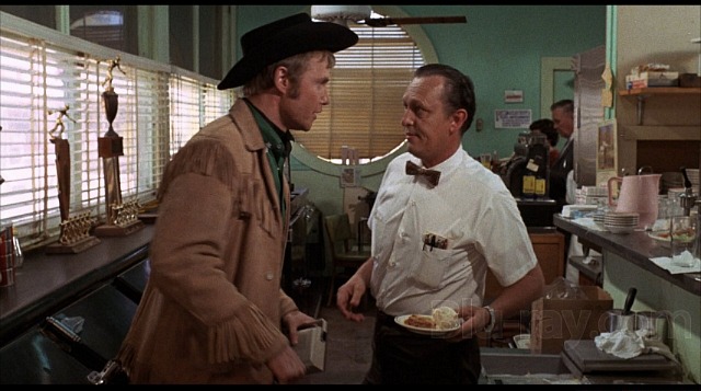
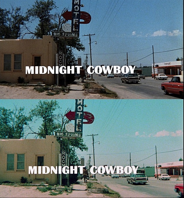
Natural-looking capture from 2012 MGM Bluray.
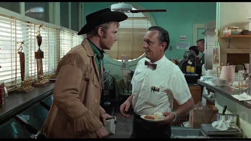
Same shot rendered by Criterion’s “teal team.”
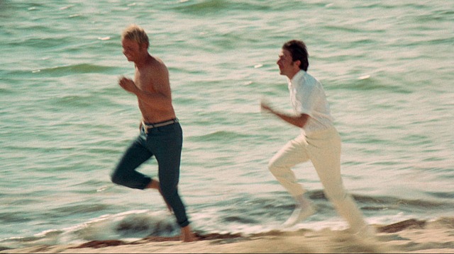
Many times I’ve gazed upon the green Atlantic Ocean while basking in the hot-sand warmth of Miami Beach.
In a 4.15 review, Bluray.com’s Dr. Svet Atanasov refuses to even acknowledge the teal-tint issue, which automatically makes you wonder what he’s up to. “The color palette [of Criterion’s Midnight Cowboy Bluray] is a lot more convincing,” he writes. “On the old release [the 2012 MGM Bluray] some of the primaries were not as stable and well saturated as they should have been and now the new 4K restoration makes this painfully obvious.”
What the hell is Atanasov talking about, “not as well saturated”? I own the six-year-old MGM Bluray and it’s totally fine, and it doesn’t have any space-alien tinting.
Please read this thread. It includes a few fair-minded, sensible-sounding remarks, but also comments from some real lunatics.
One of the latter is a guy who calls himself “RCRochester.” In a remarks about contrasting shots (Criterion vs. MGM) of a small-town Texas motel [see above], he claims that “the sky looks blue in both…it’s just that the Criterion cap looks brighter. The movie’s title in the same shot looks bright white, if the image was ‘tealed’ I would expect that to have a bluish tint to it as well.” The man has gone over the waterfall in a barrel — he actually maintains that the sky in the Criterion image is blue when it’s obviously an eerily bright blue-green.
A looney-tune named “The Green Owl” exclaims that “the screenshots look great to my eyes,” and that he’s ordering the Criterion as a result.
A guy named “Markgway” doesn’t like what he sees, but says he might go along regardless. “Unless someone can say for sure that the film was meant to look teal, I’m going to assume something is awry,” he says. “It happens too many times that older films are remastered to a modern grading standard and wind up looking suspiciously different to the way they had before.”
Some “denial is not just a river in Egypt” guy named “Fat Phil“: “I’m not seeing anything of major concern here either. The majority of the Criterion caps look absolutely fine — gorgeous even. Only a few exhibit a drastic tealinisation (that’s totally a word, but don’t look it up using a dictionary or anything ). It does not look like some oppressive blanket teal across the entire movie. Taking the caps as a whole it looks like each scene has been carefully graded.
“I understand the grumbling though – it is quite jarring change from the original Bluray, but one hopes that under the supervision of the DP presumably referring to an answer print, this would be a (more) faithful representation of the original theatrical experience.”
I haven’t watched Criterion’s Midnight Cowboy Bluray but if the above screen captures are even half-accurate it’s a travesty of a sham of a mockery of a travesty of a sham.
** The heavy teal tinting wasn’t Criterion’s idea. They went along with Holender’s visual suggestions, just like they did with DePalma two years ago.
