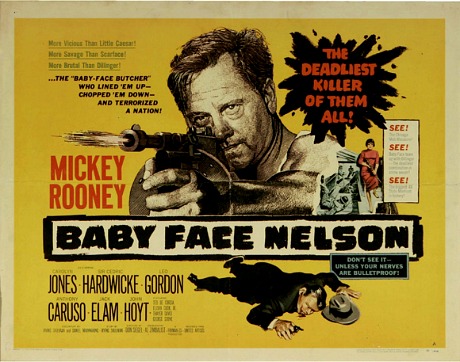
I’ve been saying for years that many Saul Bass one-sheets have seemed “better” than the films they’ve promoted. But Bass doesn’t have a monopoly on this type of thing. One example is the one-sheet for Don Siegel‘s Baby Face Nelson (’57) which, I feel, is more successful as a piece of high-impact design than the film is on its own terms. I don’t think Siegel’s gangster film stinks — it’s good pulpy fun, but the intense poster promises more than Mickey Rooney and Carolyn Jones deliver.
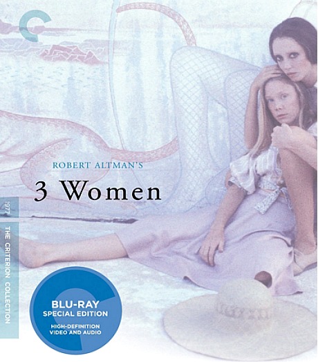
I feel roughly the same way about the poster for Robert Altman‘s 3 Women, which is reflected to some extent in the jacket art for the forthcoming Criterion Bluray. I’ve seen 3 Women only once, but it just doesn’t “do” anything. Sand and windstorms and Sissy Spacek and Janice Rule and Shelley Duvall and empty swimming pools with tiled mosaic floors and gunshots and more windstorms and sand.
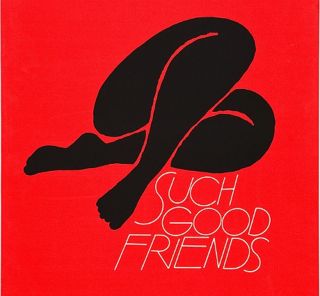
I’ve worshipped the poster for The Man With The Golden Arm all my life, but I’ve only been able to watch Otto Preminger‘s 1955 drama once or twice. Bass’s one-sheet for Preminger’s Such Good Friends (’71) is a more extreme example. The line-drawing artwork is Matisse-like in its simplicity, but the movie is all but unwatchable.
So what other posters are significantly more engrossing or profound or pleasurable or more satisfying on some level than the films they’ve been created to promote?