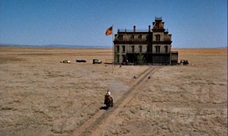
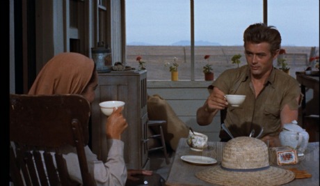
Three and a half years ago I described Criterion’s Stagecoach Bluray as “the worst-looking, worst-sounding Bluray of a classic black-and-white film in history.” Last night I looked at sections of Warner Home Video’s new Bluray of George Stevens‘ Giant, and I can say without reservation that it’s the worst-looking Bluray of a classic color film in history.” Forget the gravel-sized chunks of grain blanketing most of the outdoor footage. It’s the fuzziness of the damn thing that drives you nuts. Every now and then a shot looks sharply focused and well-balanced and generally attractive, but 80% of the time Giant looks soft and imprecise and hazy as a dust storm. It’s so bad that the word “blurry”can actually be applied. Why did Stevens and his dp, William C. Mellor, care so little about sharpness? Why would anyone want to look at a movie that looks this bad? For what purpose, to what end? I’m presuming that Stevens and Mellor wanted it to look soft-focus-y, but why the hell should I or anyone with any kind of taste in high-end cinematography want to watch it? This Bluray is a stain on the reputation of a great filmmaker. Don’t buy it. Don’t even think about it.