Last night I got suckered into sampling HBO Max on a trial basis (no billing until June 5). The fairly immense library melted me down. Five minutes after signing up I decided to watch David Lean‘s Summertime (’55), which I’d never seen in HD before.
A concise story of a 40ish unmarried woman from Ohio (Katharine Hepburn) enjoying her first visit to Venice, Italy, and then falling in love with a covertly married native (Rossano Brazzi), Summertime is a swoony, Technicolor dreamboat dive into the charms (architectural, aromatic, spiritual) of this fabled city.
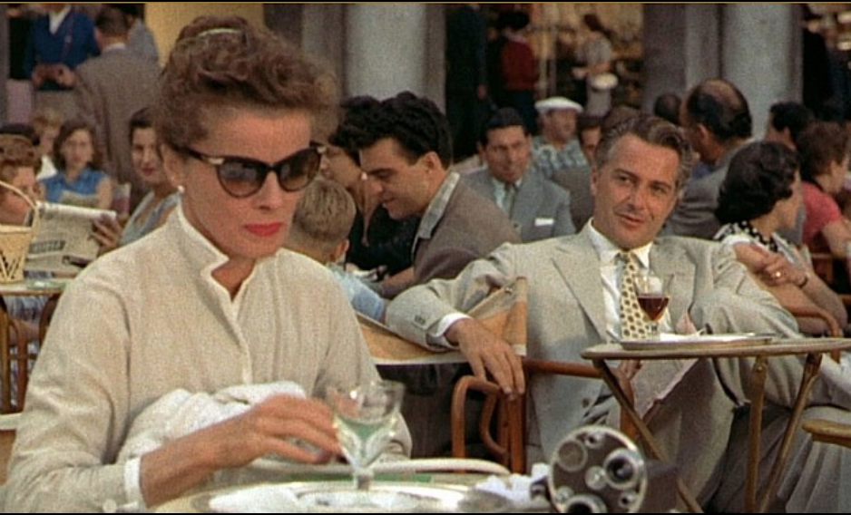
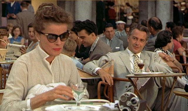
The cinematography by Jack Hildyard (The Bridge on the River Kwai) is perfectly framed and lighted, and the fleet cutting by Peter Taylor ensures that each shot is perfectly matched or blended with the next.
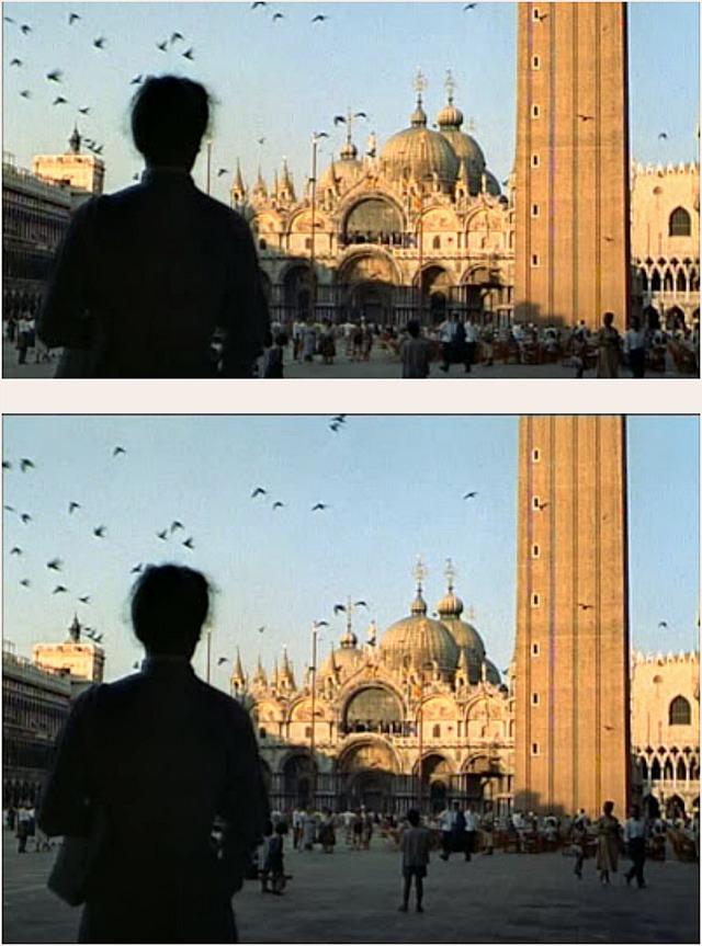
A cleavered 1.85 image of Summertime vs. the 1.37 version.
But I was especially pleased by the 1.37:1 aspect ratio and all the extra glorious headroom that comes with that. It goes without saying that I was also delighted by the fact that a few years ago 1.85 fascist Bob Furmanek had expressed profound irritation with Summertime‘s boxiness. I’ve read that Lean preferred the 1.37 version over the cleavered 1.85 version, which is what Furmanek and his fascist allies reflexively wanted to see.
Furious, fuming Furmanek = ecstatic HE.
Seven years ago David Brayton explained the whys and wherefores on alternateending.com:
“David Lean professed a preference for the 1.37:1 open matte version, giving it the fairly inarguable aura of authorial intent. Looking at the film, I think it’s pretty obvious why he felt this way. Simply put, the 1.85:1 version of the movie is about people while the 1.37:1 version is about Venice. As a direct result of shooting this movie, Lean fell in love with Venice for the rest of his life. [It seems apparent that] he preferred the version that showed off the city to greater effect for that reason.”